PROPOSED BY EMPLOYEES.
IMPLEMENTED ACROSS
THE NEW ERA.
PROPOSED BY
EMPLOYEES.
IMPLEMENTED ACROSS
THE NEW ERA.
”Our Wing mark is starting to look pretty
dated and doesn't even
match with the times.
And aren't there way too many types?"
Said Soichiro Honda who was a senior
consultant at the time, pushing for
changes to the wing design.
In response to his words,
another fresh logo started to be drawn up.
They aimed for a symbol that
would unite the current logos,
and something that would reflect the Honda Motorcycle identity.
In 1988, the 40th year of Honda's founding,
a new Wing mark for the new era was implemented,
born from the ideas of employees around the world.

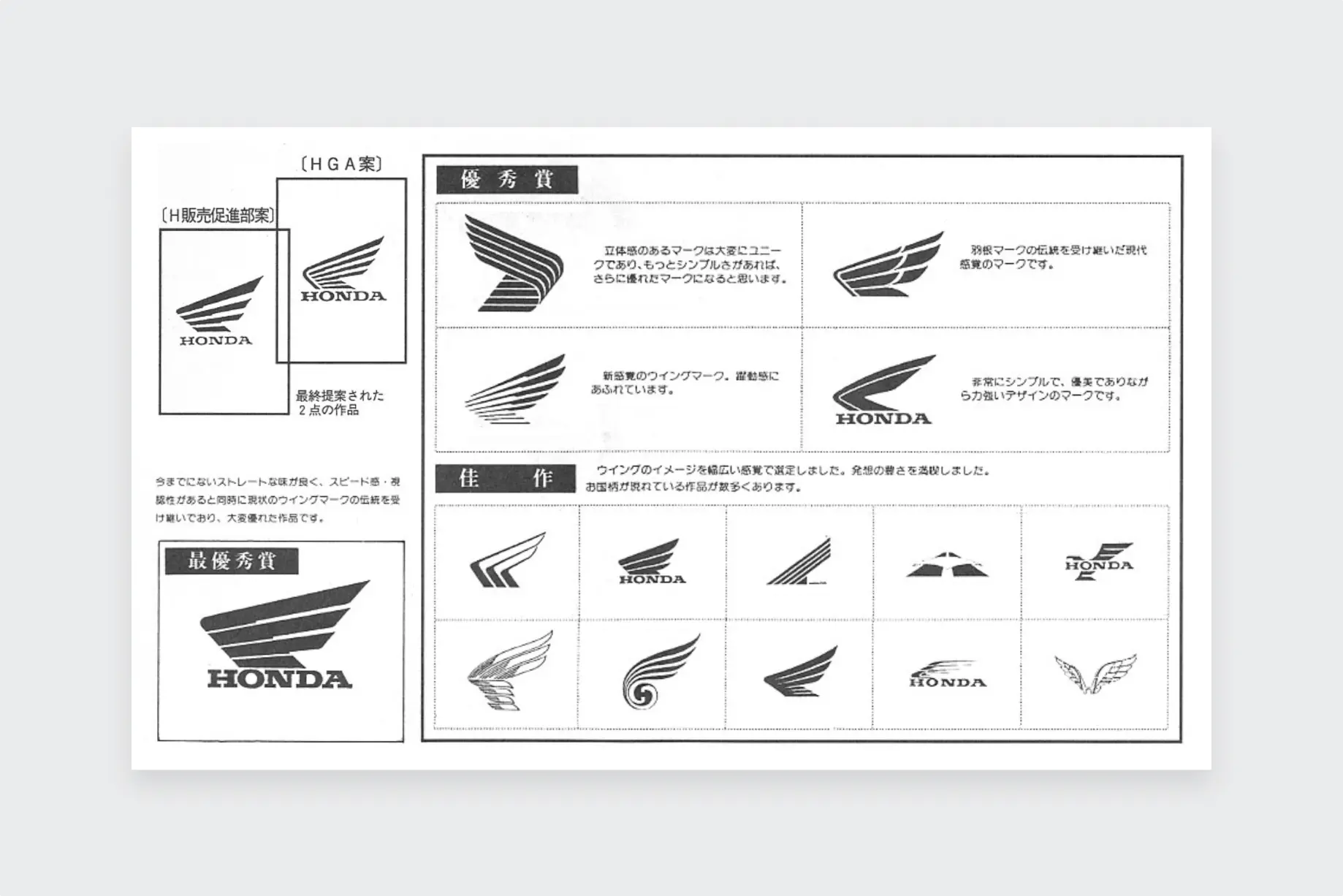
A WORLDWIDE, HONDA-WIDE COLLABORATION
A cross-department project team made up of people from departments including research, sales and marketing put out a company-wide call-out for design ideas for the new logo, aiming to attract employees worldwide. Between March and April 1987, they received around 7,800 logo designs from all corners of the globe. From those, they selected one that would be ideal as the new Wing mark.
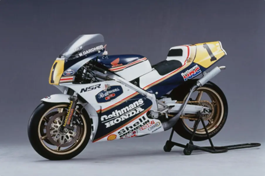
NSR500 1988
The very first bike that displayed the new logo was the NSR500, which appeared in the FIM Road Racing Championships World Grand Prix class. A red Wing mark was placed upon its navy fuel tank.
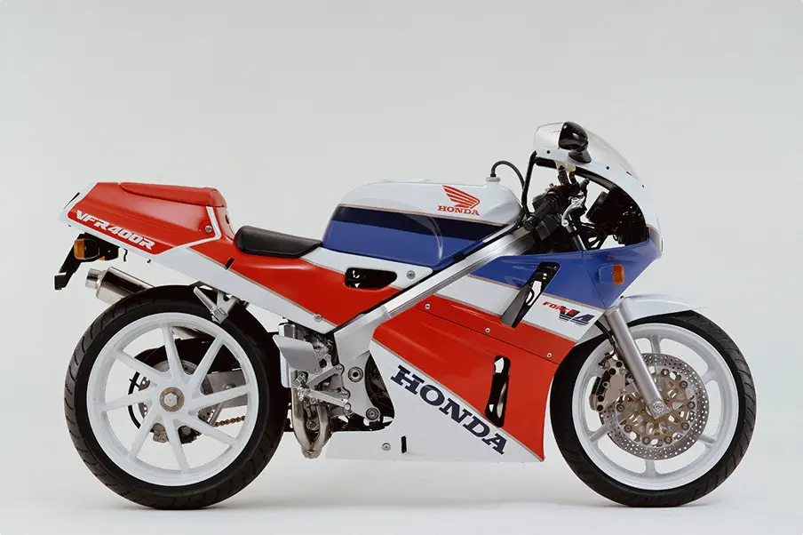
VFR400R 1989
This super sports bike was made using top-of-the-range technology taken from the race machine, RVF400, which had been a huge success in the International A Class at the All Japan Road Racing Championship TT-F3. The VFR400R was also equipped with a 4-cylinder engine that made for easy handling and high performance.