A NEW WING MARK.
A LOGO WITH A NAME.
A NEW WING MARK.
A LOGO WITH A NAME.
In response to the rapidly expanding market,
Honda released many motorcycles
through the 1970s.
From on-road to off-road to leisure,
the variation was impressive.
For the first time, "HONDA"
was used instead of "HM"
to represent Honda Motor Co.
Fitting with the rapidly-changing
motorcycle category,
the Honda motorcycle brand
branched away from the corporate logo,
and its wing symbol reflected that.

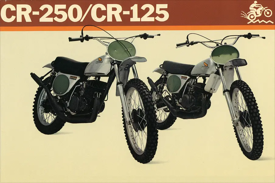
MOTOCROSS FACTORY BIKE DEBUT
It was widely known that Honda's founder, Soichiro, hated 2-stroke cylinders, but it had become harder to beat other makers' 2-strokes with the 4-stroke cylinder that he preferred. Honda's engineers began to design a 2-stroke motocross in secret, developing and test-riding it in the US. When Soichiro found out, he was furious, and told the team "If you do this, you'd better win!" giving them his blessing. The motocross didn't display the Honda logo (perhaps because they felt guilty), and Soichiro imposed the condition that it must be recognizable as a Honda product. This led to a scramble from the designers to place Honda insignia on its tank. They fixed a Honda logo onto a wing design, thereby creating a new Wing mark.
ANY COLOR GOES
Unlike the traditional Wing mark, new coloring was established in order to align with the coloring of the stripe design on each model. New colorways gradually increased.


NEW MODELS DISPLAYING "HONDA"
The first time this logo appeared on a machine was on the motocrossers. A flat sticker was used, becoming a symbol of the off-road models. On the on-road bikes through the 1970s, it was more common to fix a sticker or badge with the word "HONDA" on the tank, instead of the Wing mark. Since the 1980s, it has become common to fix the new Wing mark onto other motorcycles too.

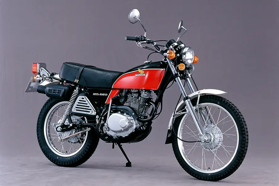
XL125/250 1975
1975 marked the off-road XL, which has remained a well-liked series to this day. The model is also popular with the on-road scene, boasting low speed stability and strong high speed performance.