FEWER FEATHERS.
MORE CONSISTENCY.
FEWER FEATHERS.
MORE CONSISTENCY.
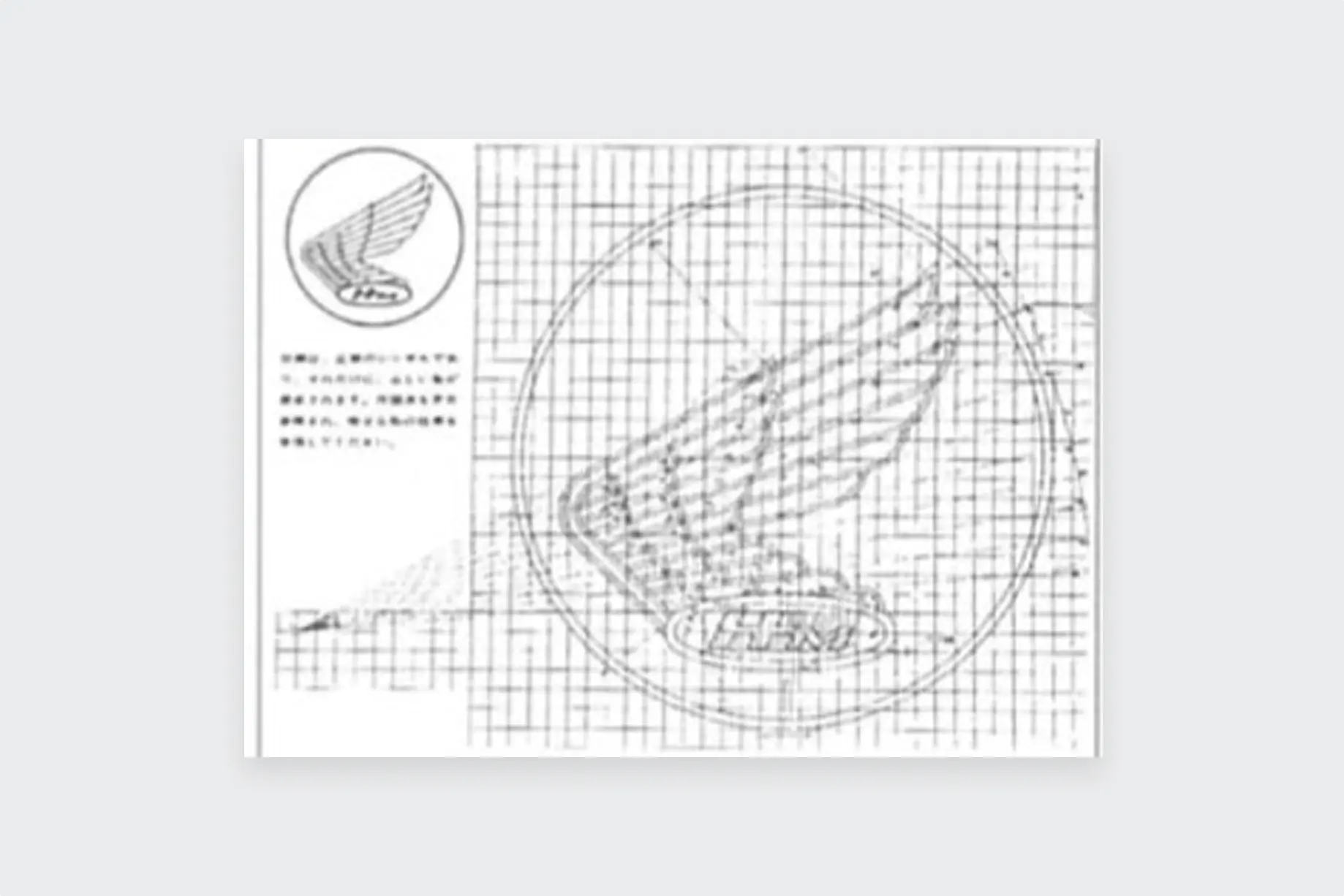
By 1968, the logo with "HM" affixed to a wing
had been used for 13 years.
In that time, the wing underwent
various small changes,
depending on the time and the product.
Eventually, a company-wide logo was set.
Rather than looking like a
realistic bird's wing,
the wing logo was simple
yet conveyed movement
in order to reflect the Honda brand.

FIXED DESIGN MEANT EASY MANUFACTURE
Honda implemented its Honda Engineering Standard (HES} to its manufacturing process in 1960. A grade "to produce efficient products with speed and reliability" was applied across the company, and reflected in the Wing mark. Even small deviations were disallowed, so the amount of feathers was reduced and each part had its own specified measurement in order to pass the HES. This made the logo easy to reproduce.
A NEW STANDARD
The Wing mark was formally fixed, to be used throughout Honda Motor Co. new global business arm. It was used as the company logo until 2000.
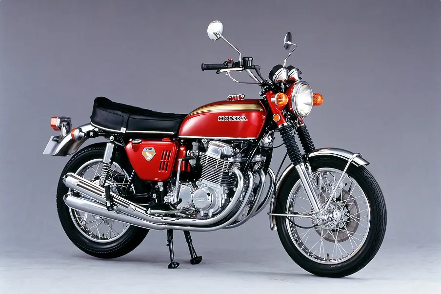
DREAM CB750 FOUR 1969
At the 1968 Tokyo Motor Show, Honda showed a brand new model — a hyper-performance vehicle of exceptional exhaust volume, power and speed. Boasting incredible spec, such as the world's first mass-produced 4-cylinder OHC power unit, its rivals did not even stand a chance, with the bike even birthing an original word for a new, golden era in Japan: "Nanahan." The model ensured that Honda's name was famed throughout the world. Its multi-cylinder set-up is still used today.
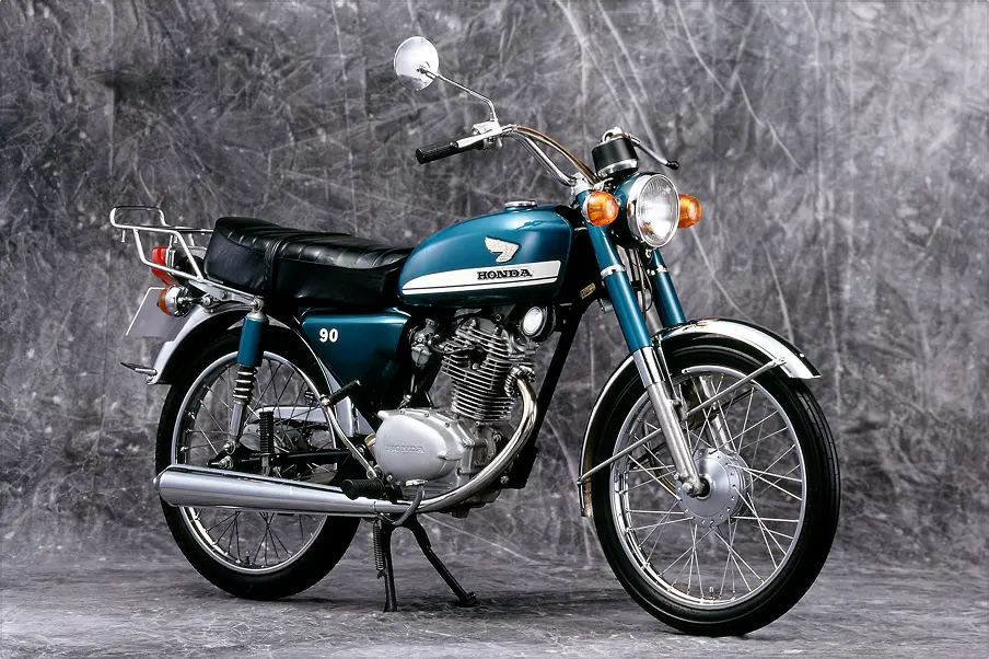
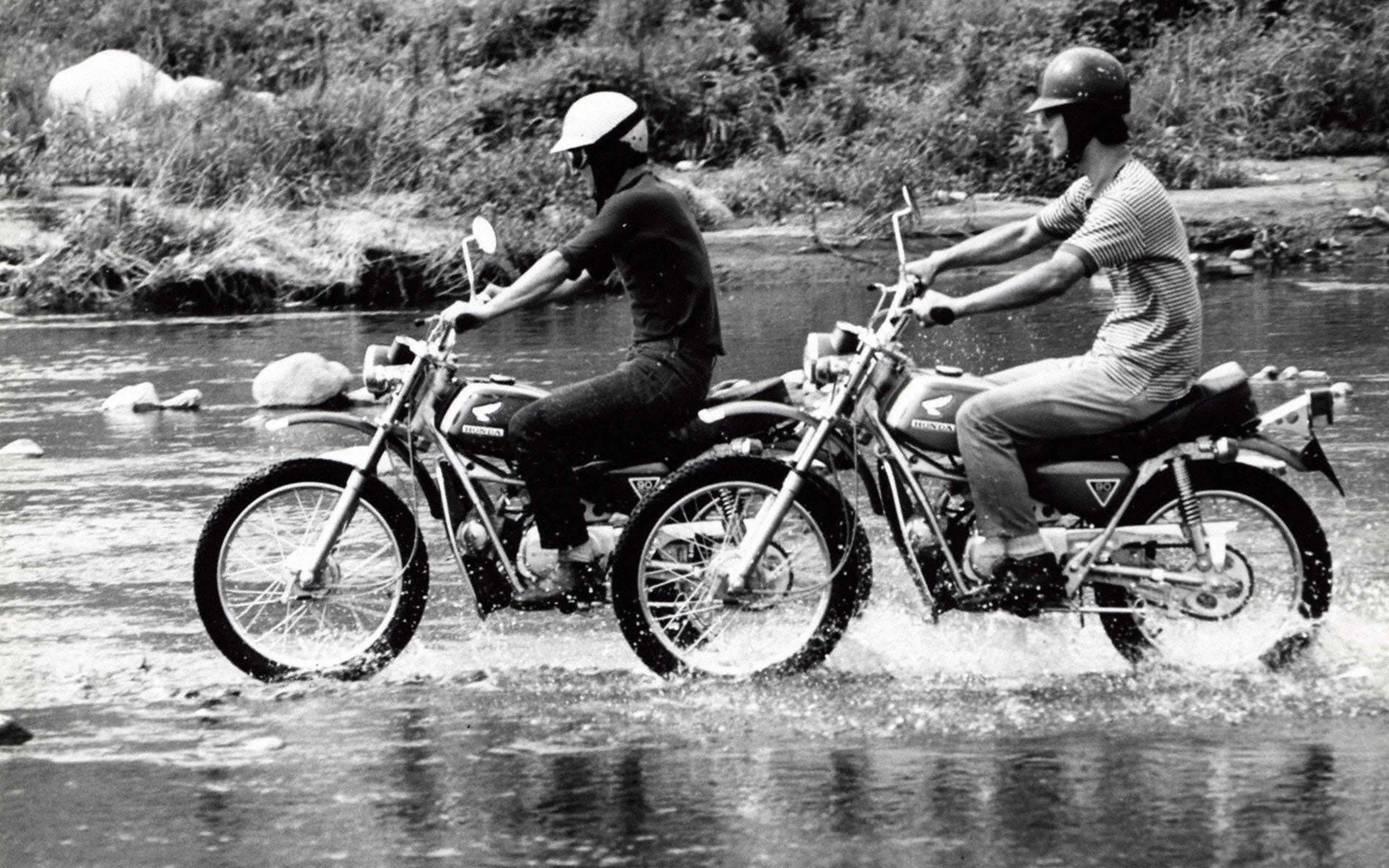
Benly CB90 1970
At the end of the 1960s, the 90cc was in high demand, and competition was rife among makers in the Japanese motorcycle market. Honda decided to add to its current available model with a highly efficient sports model, to be made not only with Japanese but also US consumers in mind. From here, the Benly CB90 was born, eschewing the flat engine in favor of the upright single cylinder, and replacing the backbone frame with a diamond shape, preferred for its high rigidity. This high-performance model boasted 5-speed transmission and a maximum output of 10.5PS. Its stylish exterior was a hit with young riders.