WINGS APPEAR
FOR THE FIRST TIME.
WINGS APPEAR
FOR THE FIRST TIME.
Wings were first used in the Honda logo when the Benly J went on sale in 1953.
The logo was fixed onto both the
right and the left sides of the tank,
designed like a bird spreading both its wings.
Soichiro Honda told his employees:
"This fight is global.
Honda isn't aiming to be the best in Japan.
Our goal is to be the best in the world."
We can see this in the design,
like a bird flying the nest.
The design, originally used on
Honda's flagship vehicles,
marked a turning point: from here,
the Wing mark started to emerge.

HONDA'S WINGS SPREAD ACROSS THE WORLD, AS ENVISIONED BY SOICHIRO
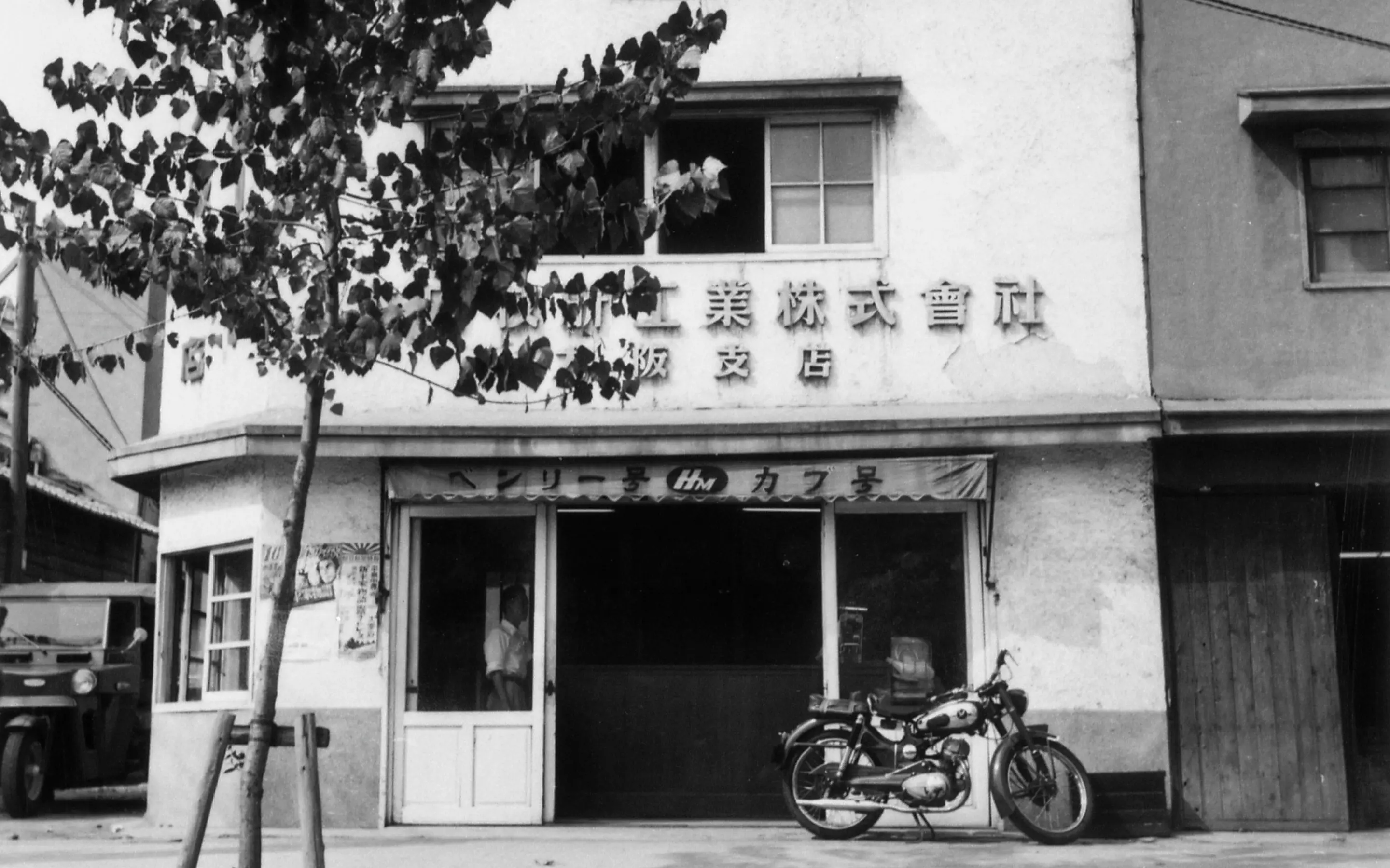
It's said that the Benly J's front fender mascot plate was modeled after Soichiro Honda's instructions to the developers: "We're spreading our wings across the globe, so make it super clear that we're flying!" The header design for internal documents also gradually changed into an open wing symbol.

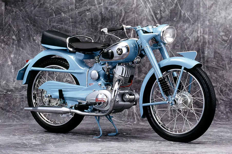
BENLY J 1953
The Benly J was built for convenience, and its friendly price point made it easy to purchase. It had an integrated engine and Honda's original see-saw rear suspension. At the time, lightweight, bicycle-style vehicles were common, but the Benly J was sold as an authentic motorcycle. It was an instant bestseller.