A FEMALE FIGURE.
SOARING THROUGH
THE SKY.
A FEMALE FIGURE.
SOARING THROUGH
THE SKY.
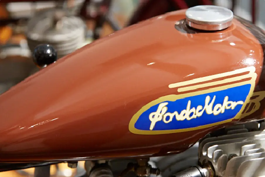
The very first Honda logo had bold
“HONDA” lettering behind a racing figure.
Affixed to the very first Honda product,
it was inspired by Nike,
the Goddess of Victory from the
Ancient Greek masterpiece,
"Samothrace," and its wings were
modeled on those of an eagle, king of birds.
Her leaping step conveys Honda's unwavering determination
to develop and progress.

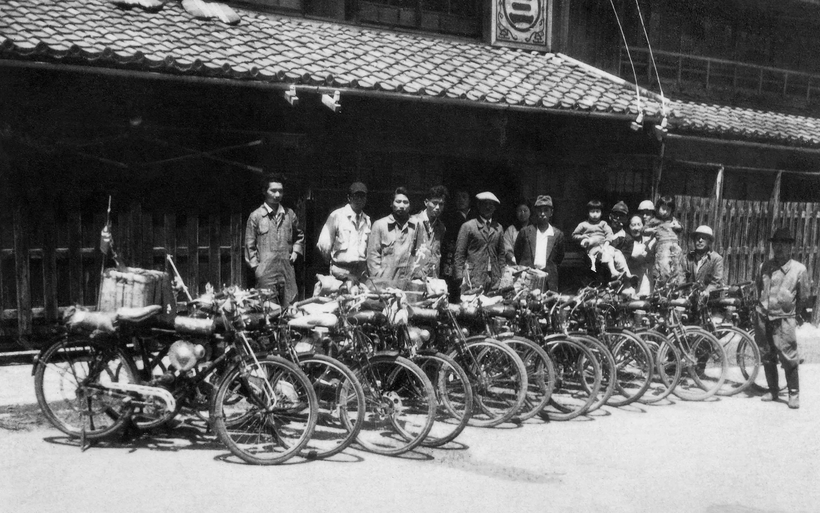
THE DAWN OF HONDA: A FIRST PRODUCT, MADE WITH CARE
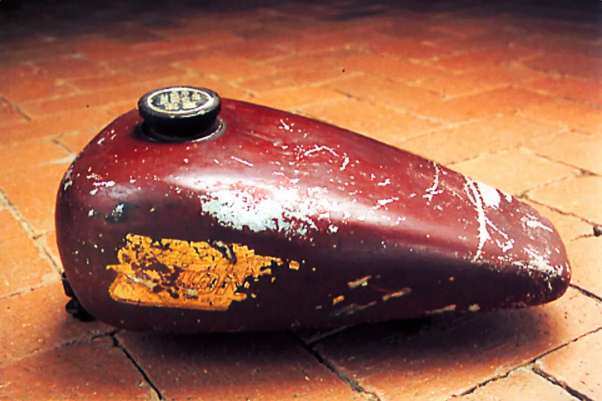
The first edition of Honda's Wing mark was attached to the streamlined tank of its very first product: the Model A auxiliary bicycle engine. It symbolized Honda's dreams of global expansion. It's thought that Soichiro Honda, founder of the company, came up with the logo himself, although unfortunately there are no records to prove this.
HONDA'S FIRST EVER RECOGNIZABLE LOGO
The mark wasn't limited to Honda products — it was used in everything, from billboards to company documents. Even though it wasn't technically official at this point, we can still say that it was Honda's original logo.
EVERY SINGLE MARK IS UNIQUE
At the time, the Wing mark was handpainted by staff, so even though the bikes were mass produced, each logo on the A-Type auxilliary bicycle engine was slightly different. Early examples of the logo — Honda's nude female figure racing through the sky — on the A-Type have bits of paint on the tank, and others are clearly copied from photos. Around this time, the director of the Honda Collection Hall decided to completely recreate the original engine so that visitors coming by would be able to see it. Using the small amount of information available, it was reproduced in full.
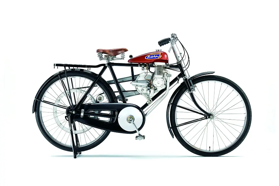
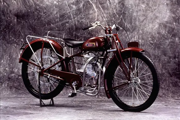
Honda A 1947
The bicycle auxiliary engine could be easily affixed to bicycles on sale to the general public. It was named "A" after the first letter of the alphabet, because it was the first product made by Honda Motor Co., in 1947, one year prior to its founding. Developed in-house, the engine was nicknamed the "chimney engine." At first, the engineers were optimistic with regards to engine power and fuel efficiency, yet because it was so hard to manufacture, and difficult to predict engine reliability and durability, development was stopped, and the original 'creative' engine was consigned to finish as a prototype. In the end, they developed the engine by fixing a rotary disk bulb and a carburetor onto the tank casing, a revolutionary move at the time.
Honda Model C 1949
The Model C was Honda's first motorcycle that used an engine and a frame designed in-house. It had a girder front end and a cantilever crankshaft, and won top place in its class at a Japanese-US friendly held at Tamagawa Speedway.
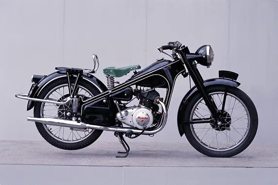
Honda Dream E 1951
The Dream E was the first to be equipped with a 4-stroke OHV engine. Even though the small, lightweight, 2-stroke engine was the popular choice at the time, Honda's founder, Soichiro Honda, envisioned an efficient engine with exhaust gas that wasn't as bad for the environment. He demonstrated the vehicle's durability by crossing the Hakone Pass on it: the ultimate test.