How “conceal and reveal” became a Honda tradition
Changes in camouflage livery designed to conceal details
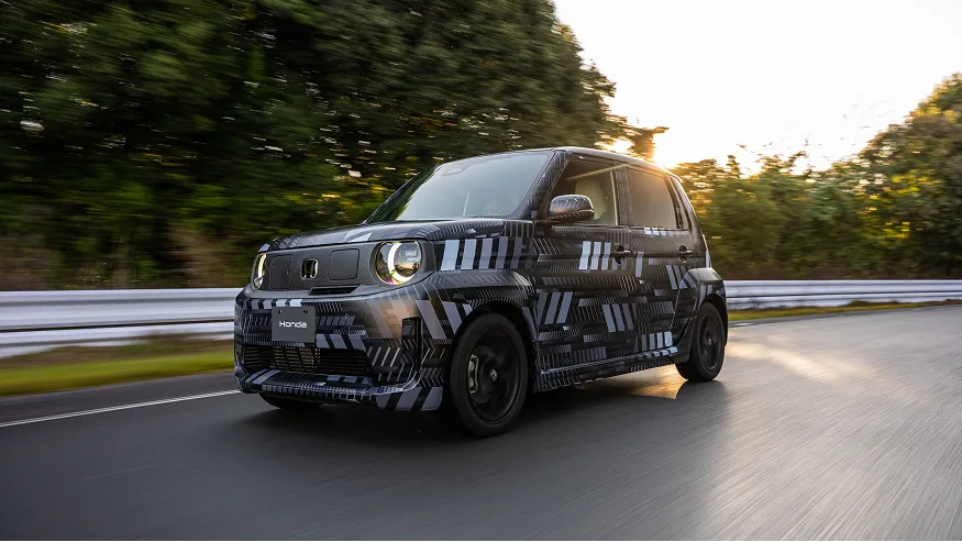
―Camouflage livery is used as a way of concealing the shape and character lines* of a new car under development while test driving on public roads. Covering the car with noisy patterns such as zebra stripes or arabesque patterns makes it difficult to properly perceive the details of a car prior to launch.
* Character lines are lines across the surfaces of a vehicle body that are designed to highlight distinct features of its shape. They are an important element of a car's individuality.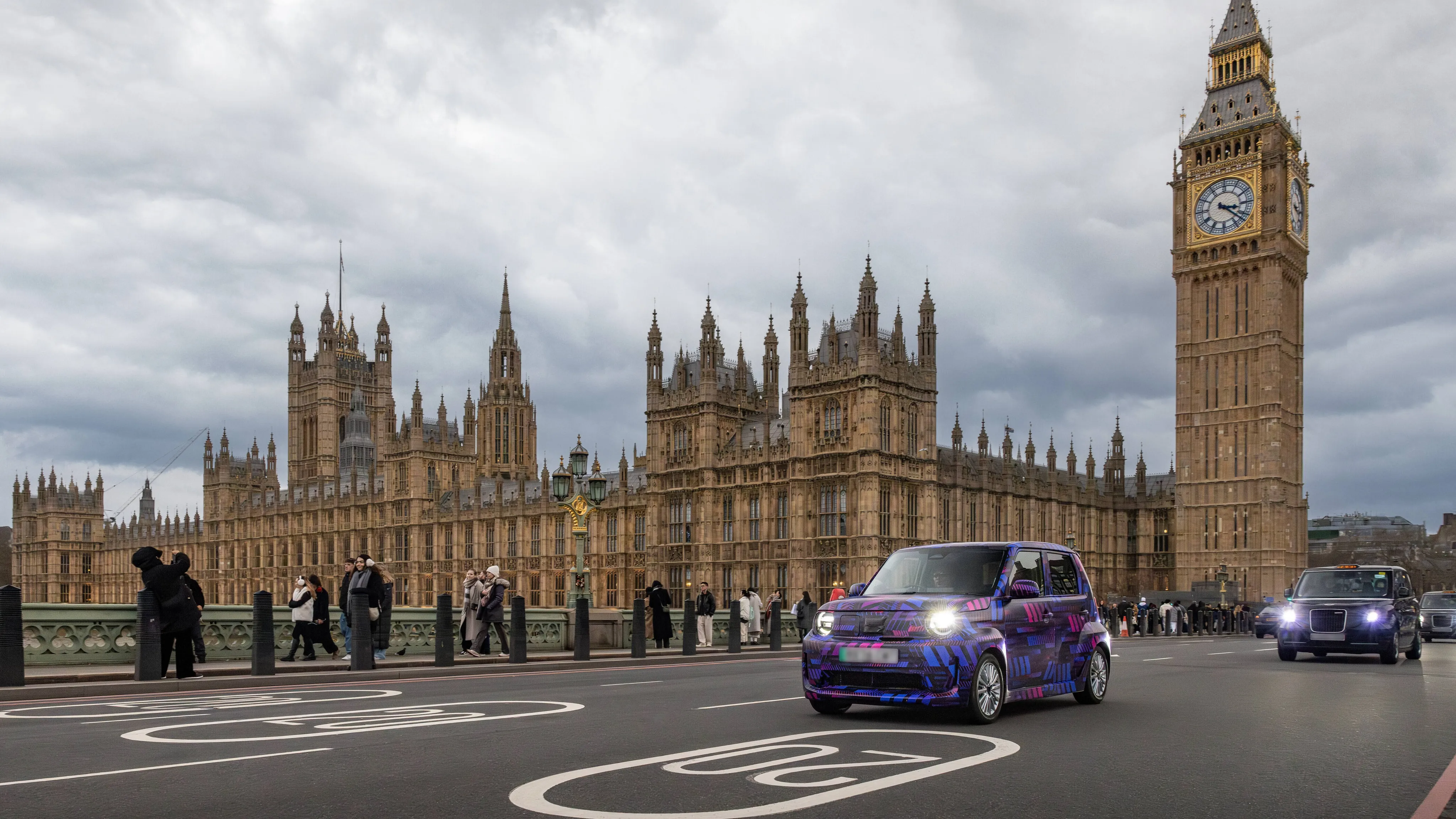
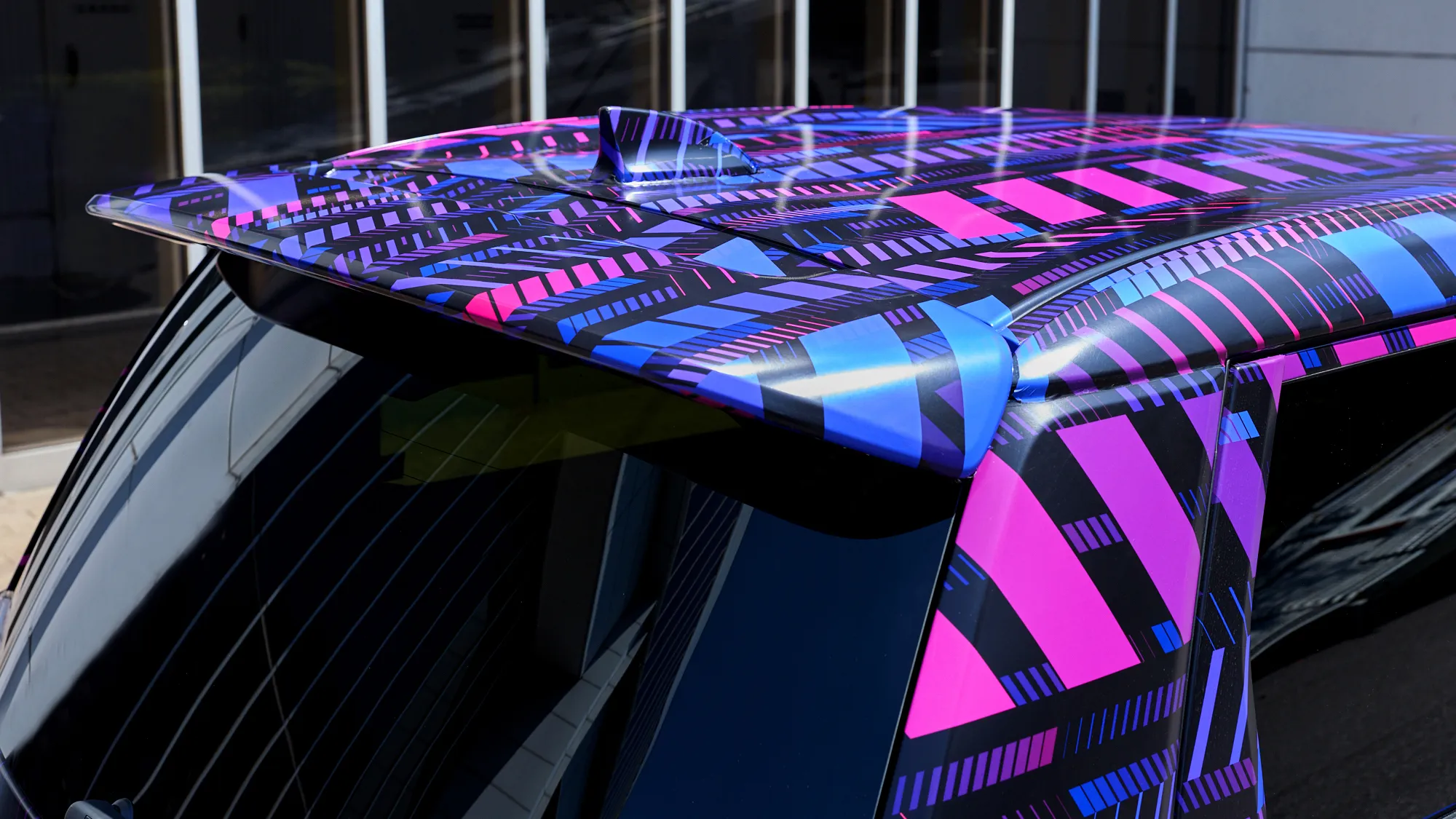
―In recent years, images of cars dressed out in camouflage livery have spread through social media and other channels, driving interest in new models prior to launch.
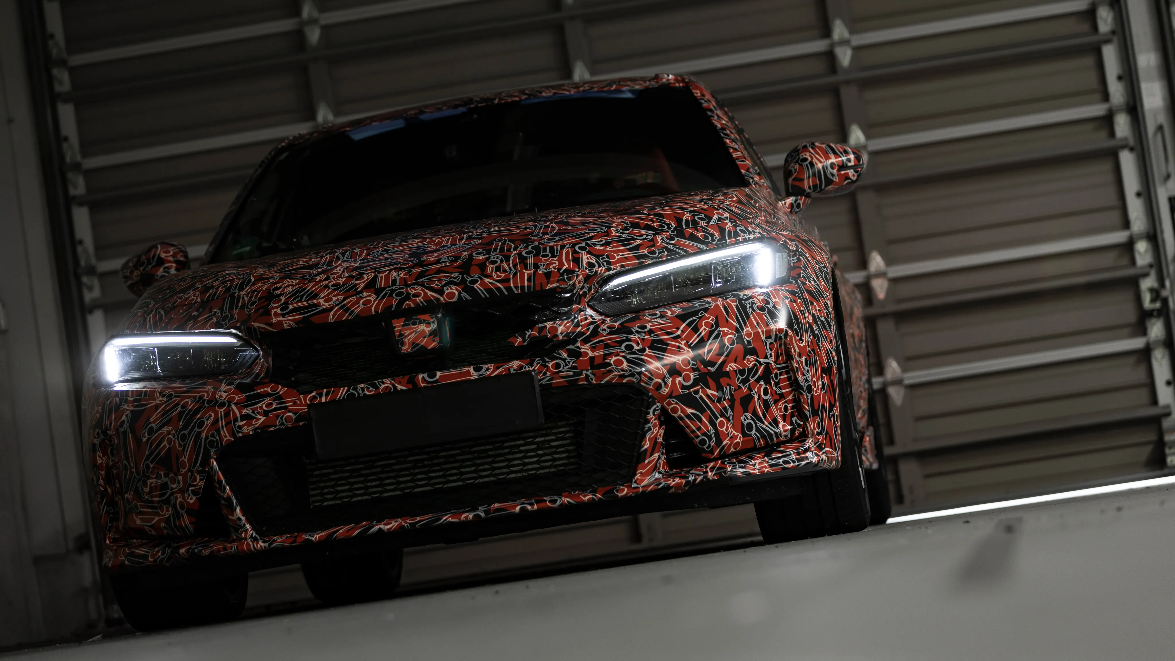
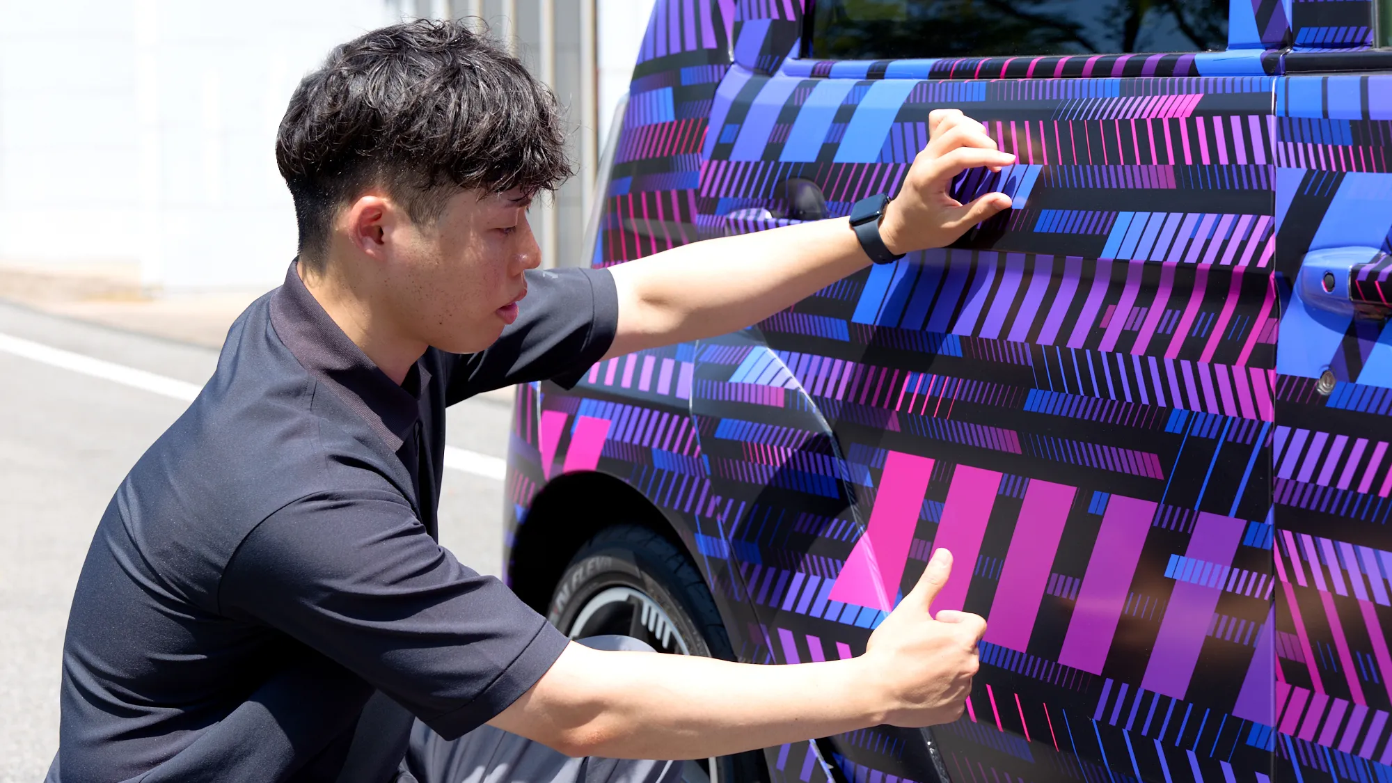
―Honda's approach in choosing camouflage livery has not just been to conceal a car's details, but to also show its character.
While contradictory, its purpose has been twofold; to disguise and hide shapes, and to create product reveal that catches interest. For this reason, the person in charge of body development and designer in charge of camouflage livery on the Super-ONE discussed this approach from the very beginning, launching the project after making the decision to focus more on appeal than on disguise.
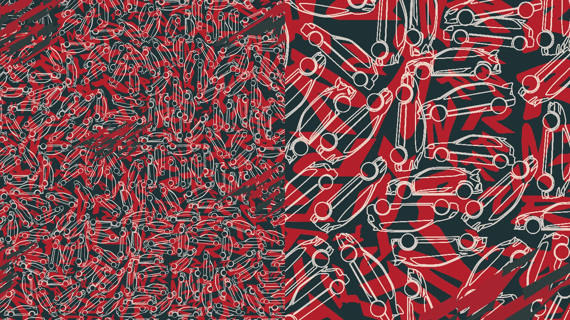
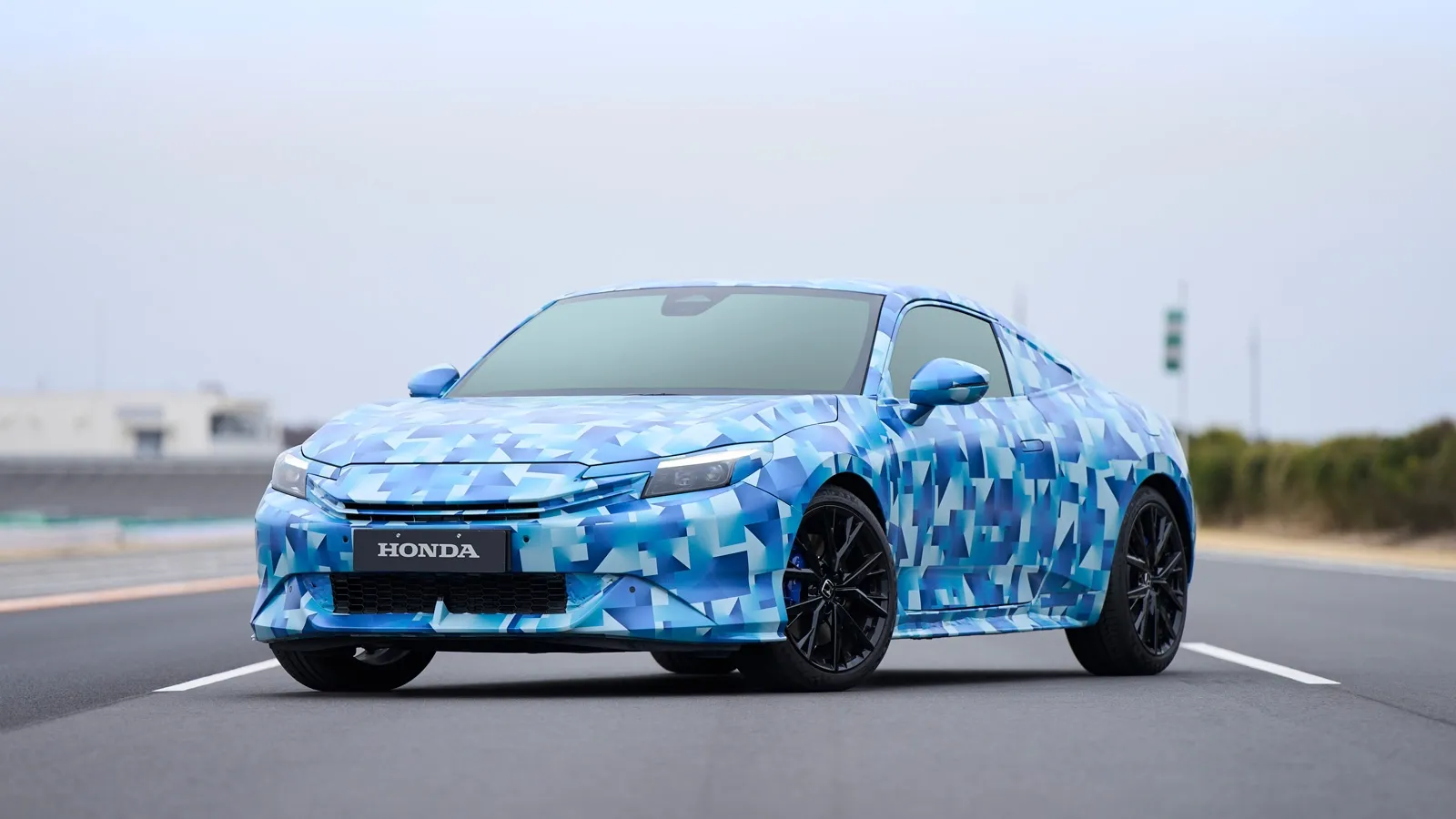
―This perspective had its beginnings in Prelude development. No thought was given to determining proportions at the time, so the graphics ended up prioritizing concealment. Drawing on this experience, the development team and designers shared policies prior to starting work on the Super-ONE, and considered graphics that would more actively express the unique characteristics of the model.
A look into the production process of graphics that bring the Super-ONE to life
Parallelogram motif derived from Super-ONE's duality
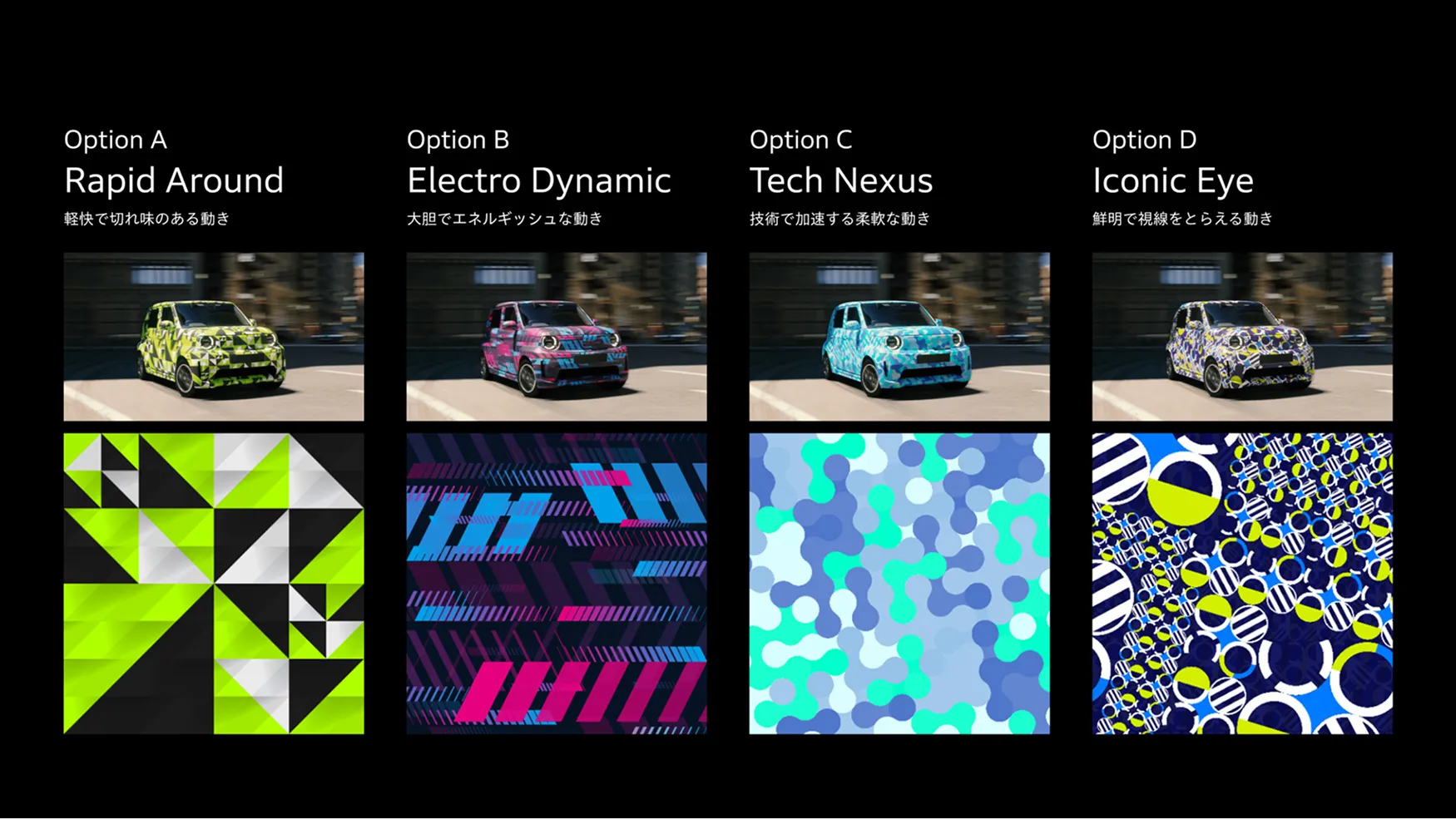
―The camouflage livery of the Super-ONE was rolled out in the UK, Indonesia, and Japan. With each region having its own perception of EVs and other cars, ways that light hits surfaces, cityscapes, and roles and atmospheres of each exhibition event, three color schemes were developed for the three regions while maintaining a unified concept overall.
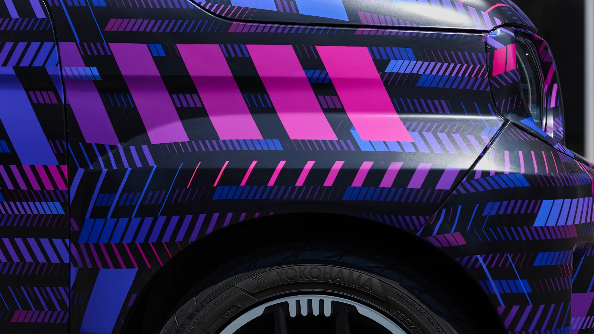
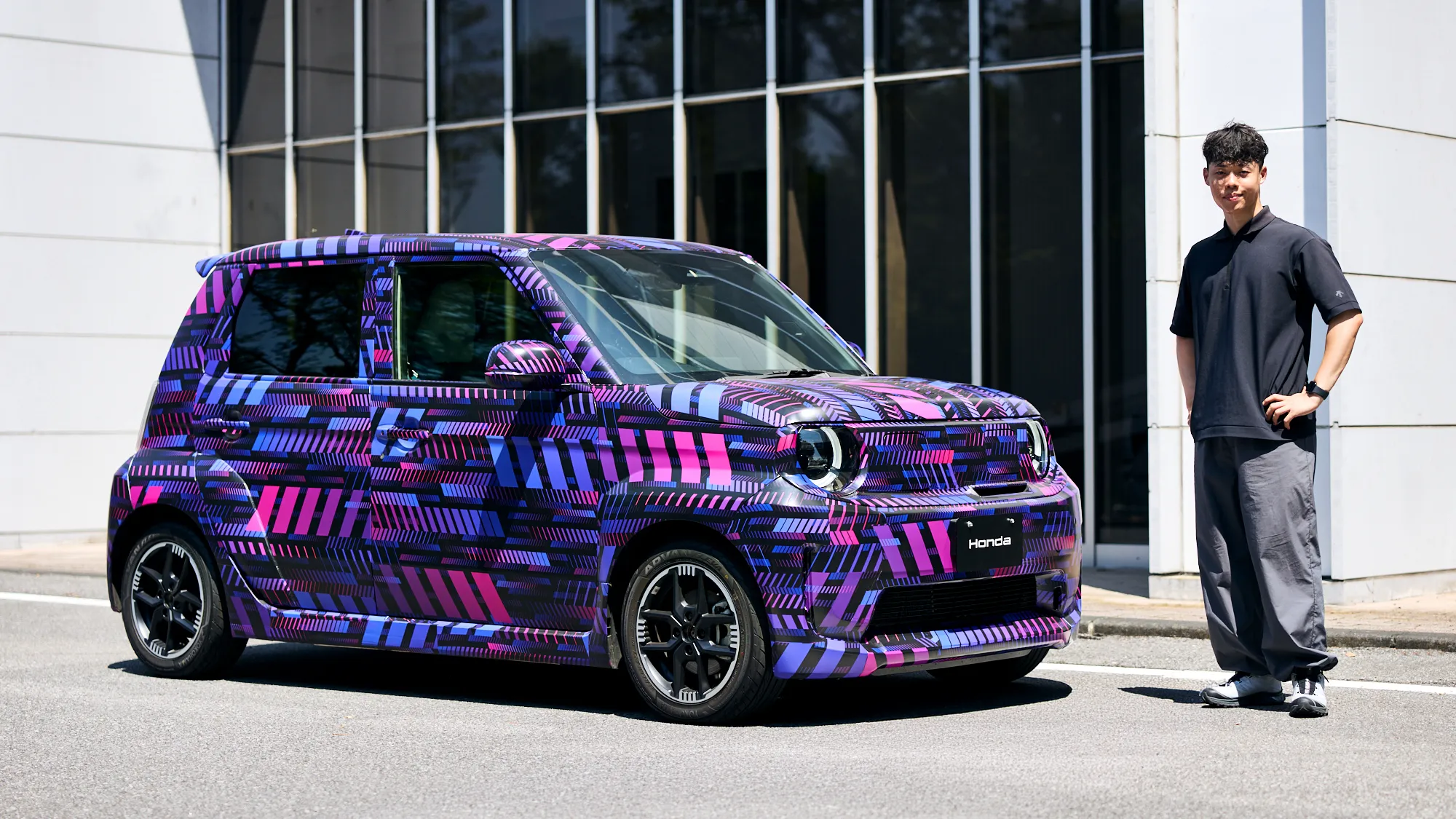
―When creating the UK design, which was the first, the deciding factor after discussions with the development team was how well the graphics connected to the original concept of the car. Masaki Nagai, who designed those graphics, spoke about the early stages of the process.
Nagai
The first time I saw the Super-ONE, I was impressed by its stable, boxy form achieved through a flared stance. I thought it looked really cute. On the other hand, when I talk to the development team, they all say it is a fun car that is great to drive.
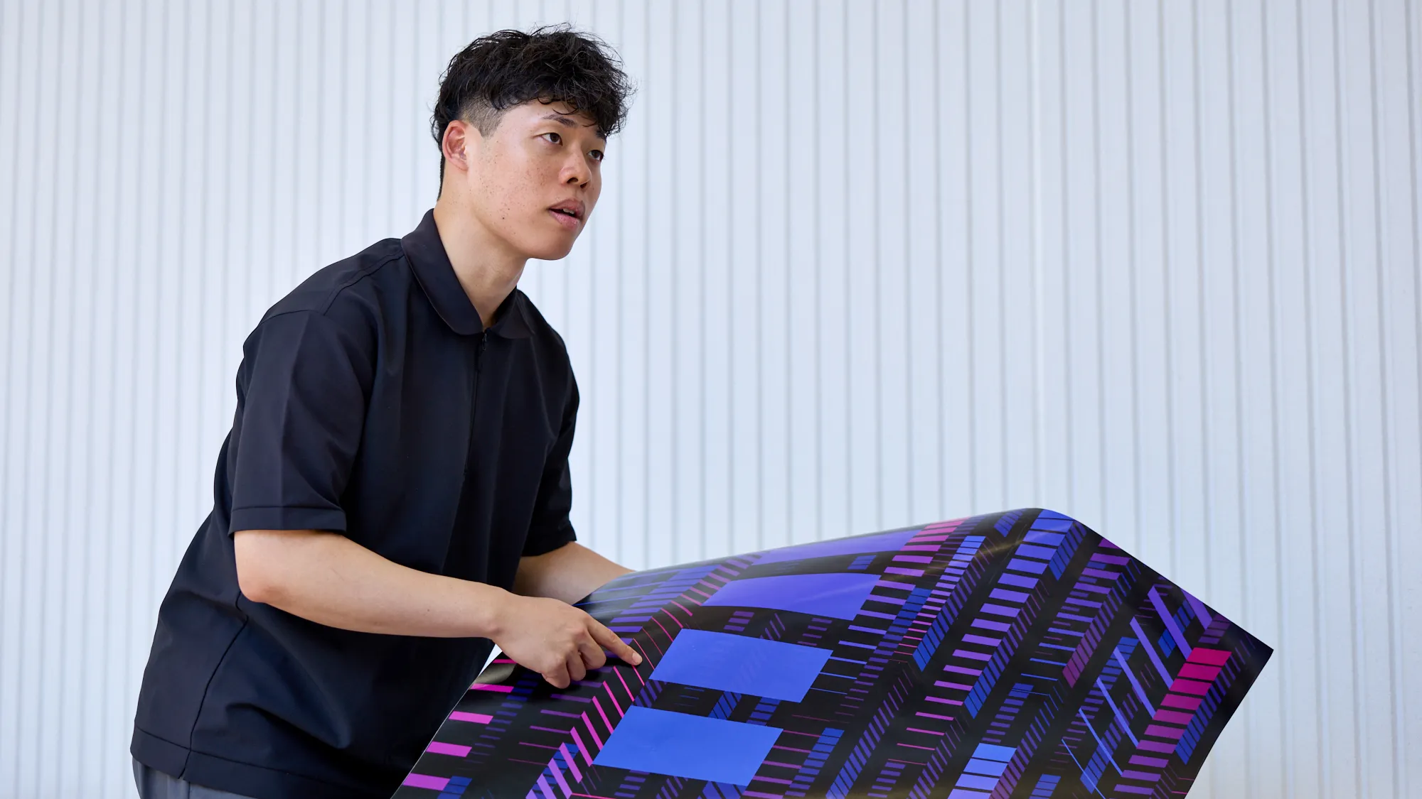
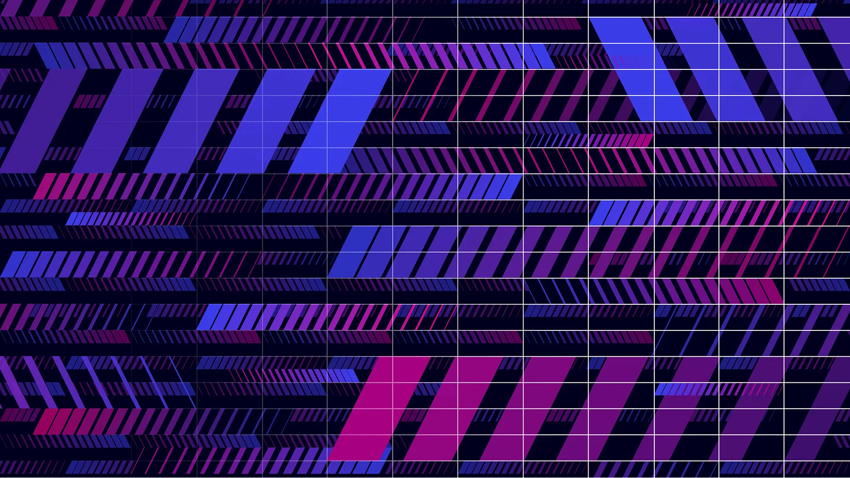
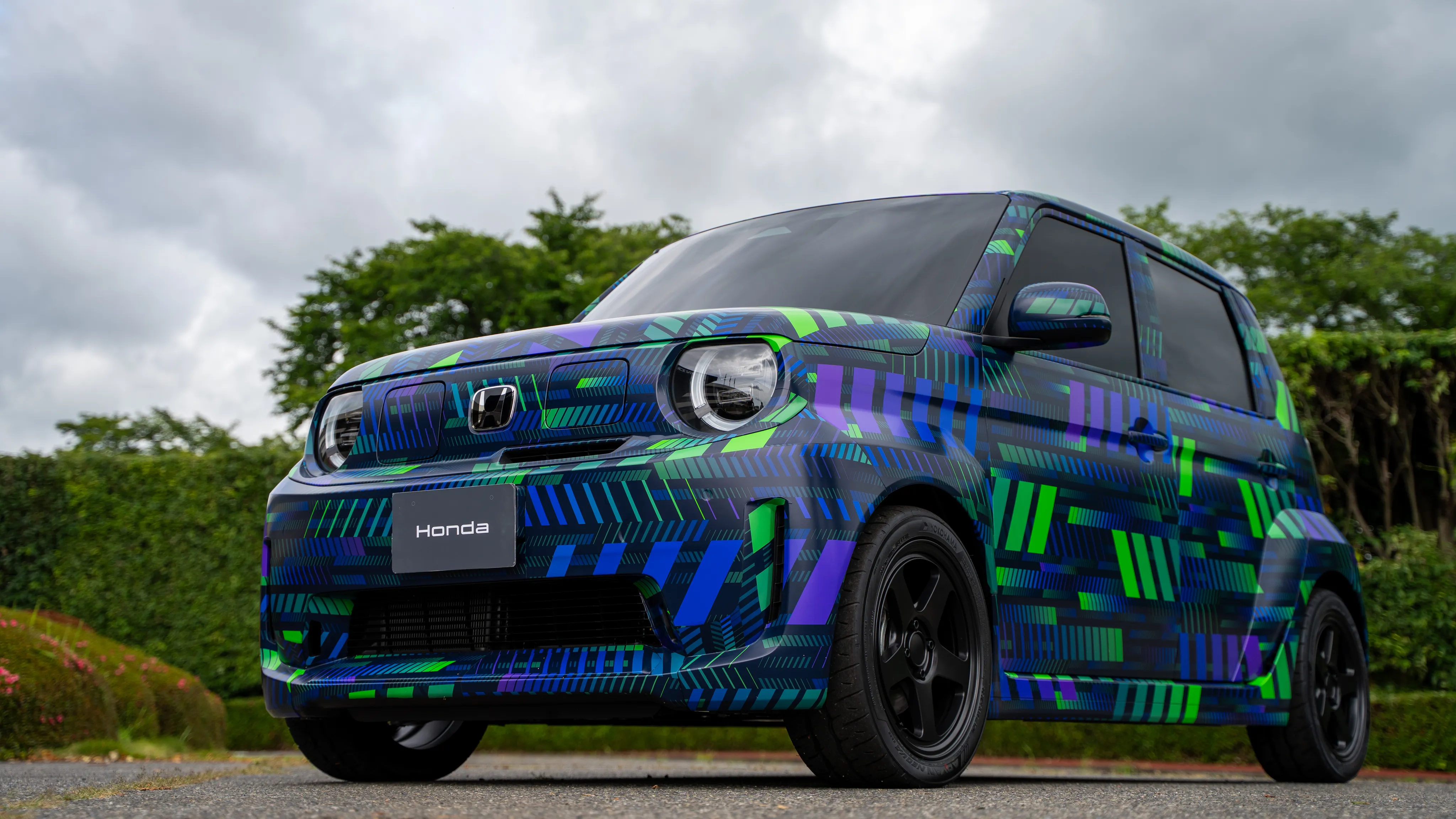
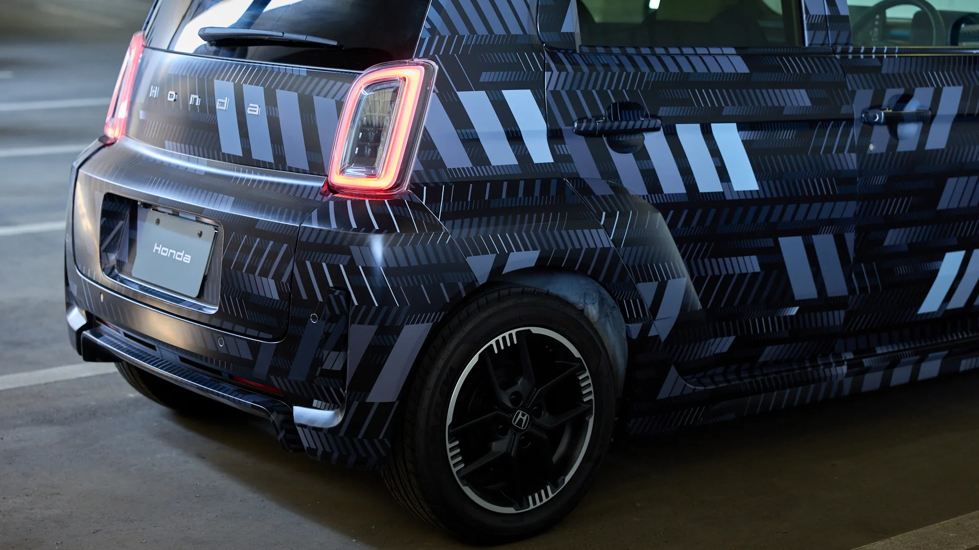
―Nagai placed this duality of appearance and drivability at the heart of its graphics. At the core of the design is a motif of continuously arranged parallelograms, with a sense of stability (suggested by the boxy form) expressed through shape, and a sense of speed (the pride of the development team) expressed through repetition. Overall, the graphics were precisely designed down to the size and layering of each shape.
Nagai
The design consists of four sizes of parallelogram, with each size being twice as large as the previous one (1—2—4—8), in a three-layered structure. The large sections give a sense of strength while the small sections give a sense of precision. The shapes are laid out neatly in a grid pattern and deliberate misalignments are added to provide a bold movement to the pattern. When I work on design, I usually start in monochrome while working to improve the performance of the graphics themselves. After completing the design to a level where it can express the concept alone, without color, I then look for the optimal color scheme.
Sense of speed and digital aesthetic conveyed through color
―Of course, the duality incorporated into the overall design is also reflected in the choice of colors. Nagai proceeded to look for colors to express a sense of speed and digital aesthetic based on a “digital iconic” style that carries the geometry and edginess of the Super-ONE.
Nagai
Magenta and cyan were the two colors that best expressed a sense of speed and digital aesthetic when used in combination with the parallelograms.
―When considering colors, there was also a belief that darker colors were better suited to the cloudy skies of the UK in winter. Consequently, the two-color scheme was adjusted to more muted colors that blended with the black background while still maintaining a digital aesthetic.
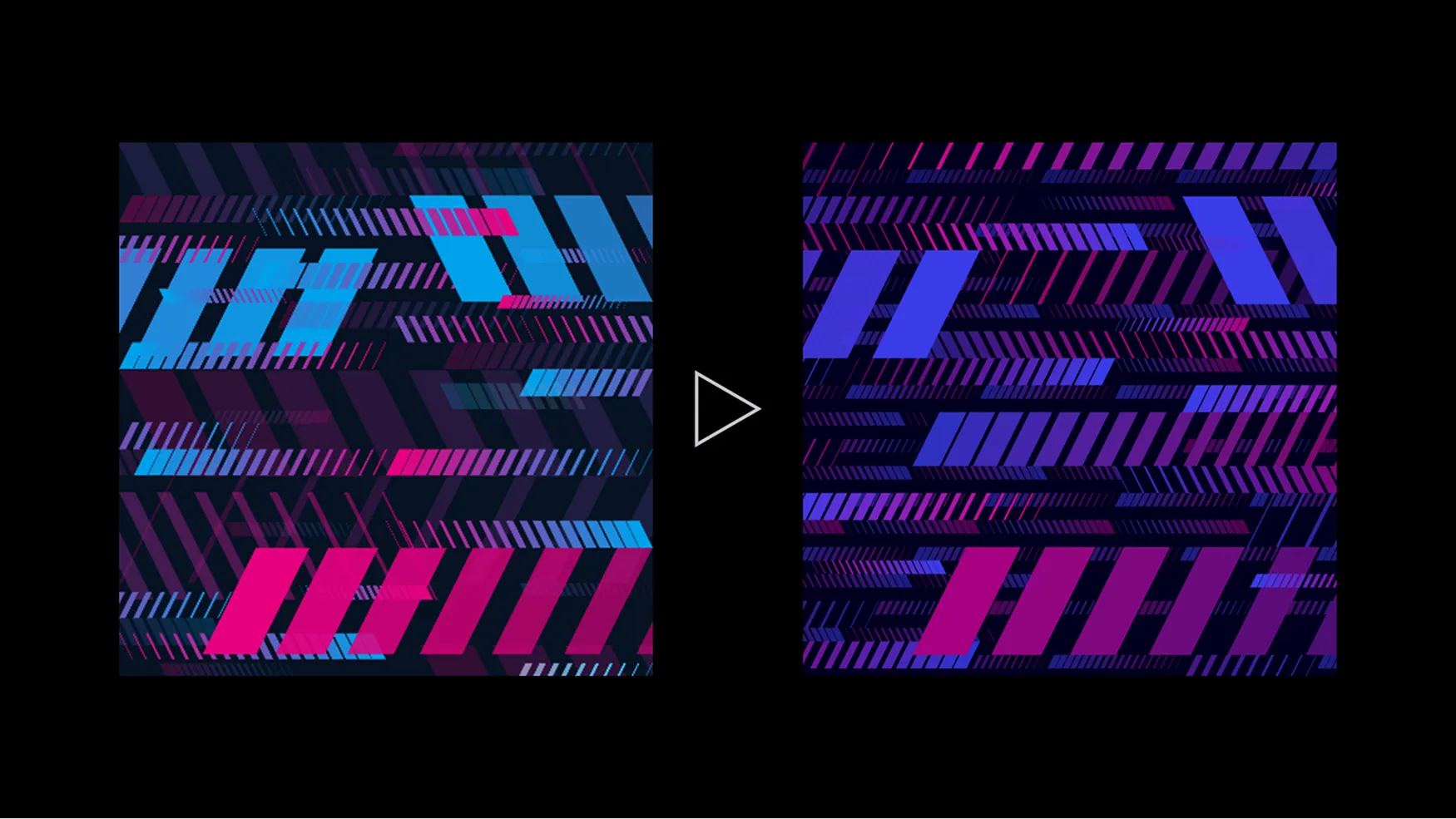
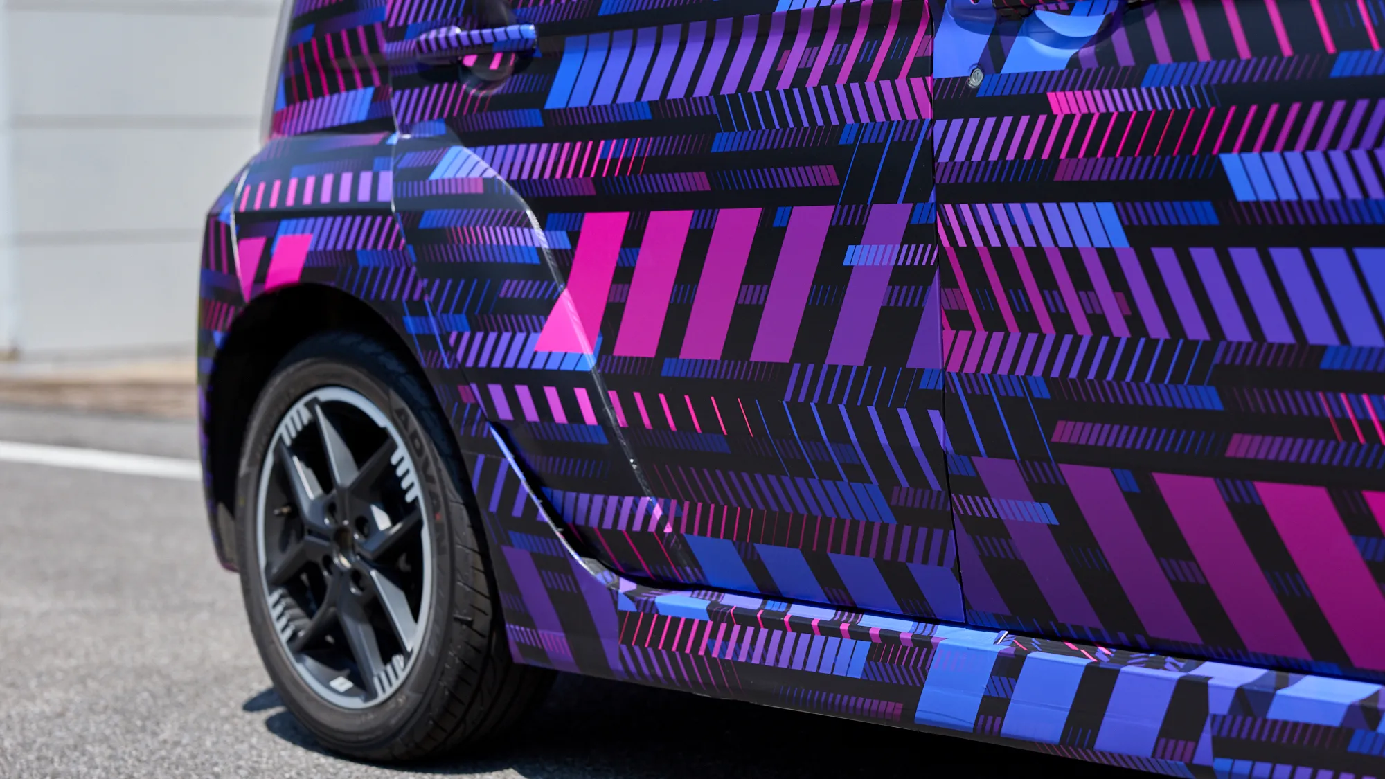
―Slightly toning down the vividness of the colors allowed the chains of parallelograms to stand out further, changing the function of color from being used for emphasis to being used to suggest movement. The livery on the UK's Super-ONE was chosen through this process.
Three camouflage liveries to be deployed in three different regions
UK (magenta/cyan)
―With a common graphic design completed, the color schemes were tailored to the specific usage environments of the UK, Indonesia, and Japan.
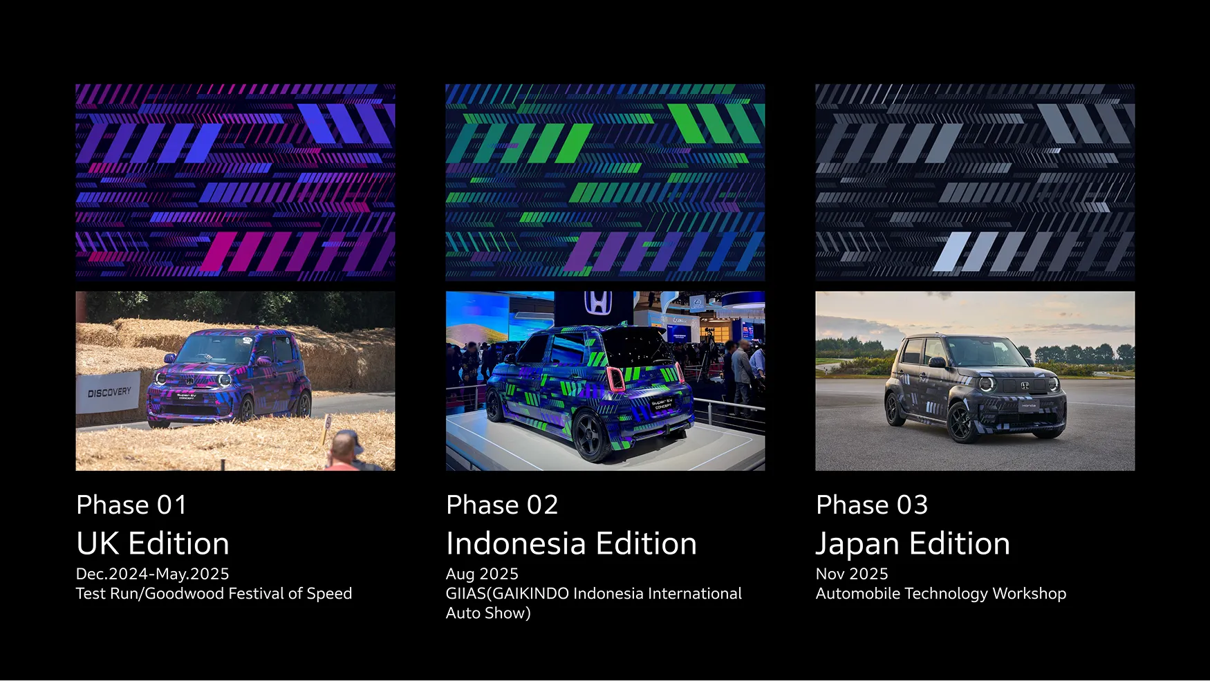
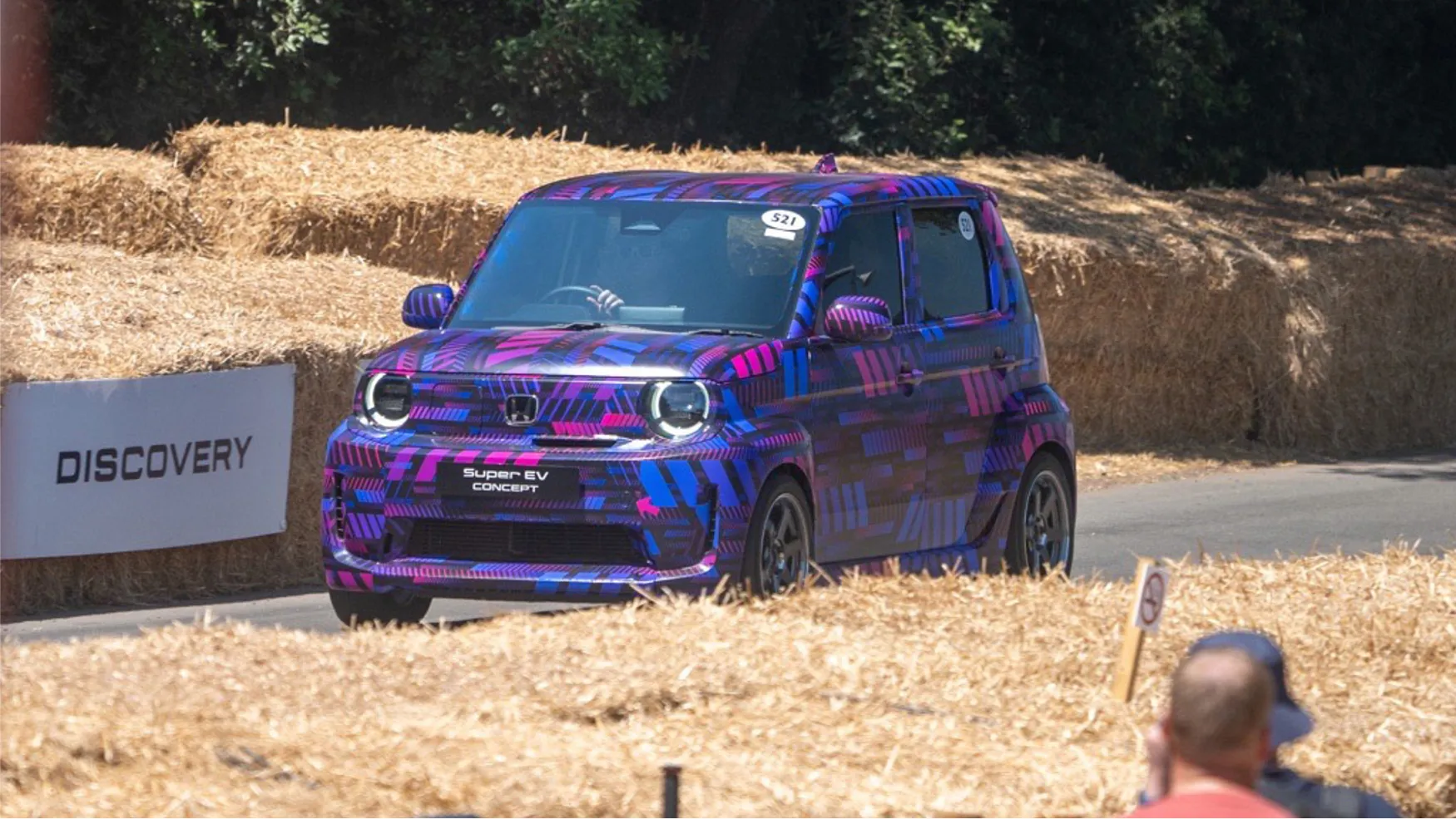
―The UK design was created with the Goodwood Festival of Speed* in mind, with parallelograms arranged in such a way that they appeared parallel to the ground when driving around the circuit. On the other hand, it was pointed out that this change made it easier to perceive the body shape, so the challenge of striking the best balance between “concealing” and “revealing” remained.
* The Goodwood Festival of Speed, one of the world's largest motorsports events, is held each year in the UK. Successive generations of racing cars, the latest cars for sale on the market, and cars currently in development all make an appearance on this circuit.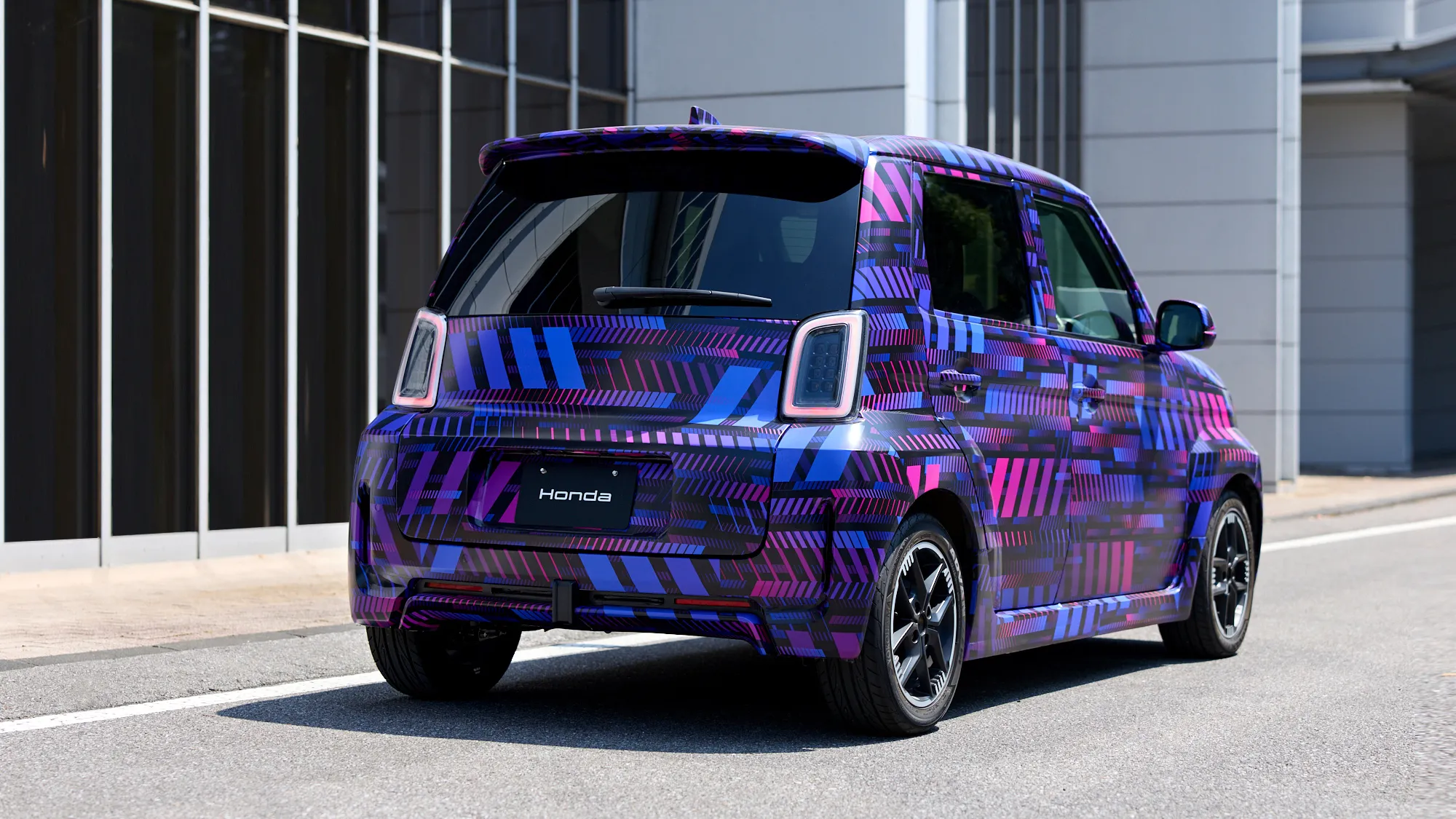
Indonesia (lime green/blue)
The next rollout was in Indonesia. In line with the sporty image that Honda enjoys in Southeast Asia, the magenta was changed to lime green and the color saturation of the blue was boosted further. Combined with gradients of each color, it created a “clean, fresh, spirited EV” image unique to Indonesia. This intense color scheme was needed to avoid a more subdued color scheme being lost in the showy atmosphere of the Gaikindo Indonesia International Auto Show (GIIAS).
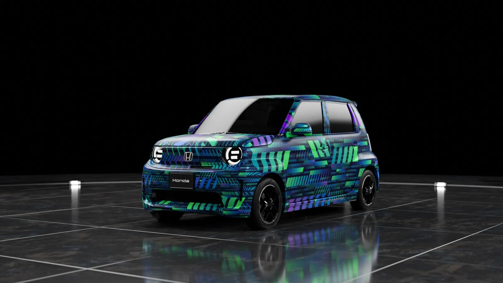
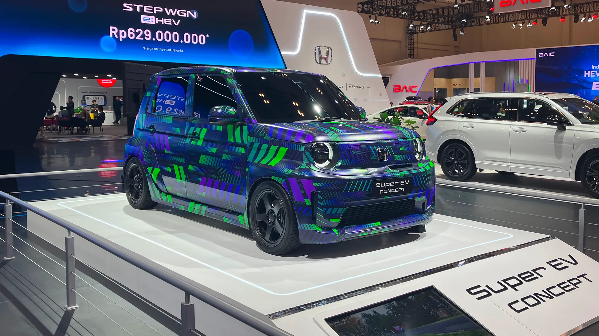
The GIIAS is an exhibition where many of the visitors are actually considering car purchases, so exhibiting a car under development, amid numerous mass production models, was unusual in itself. On top of that, deliberately exhibiting the car in its camouflage livery was aimed at gradually building anticipation ahead of the launch, which was still some time away.
Japan (gray/black)
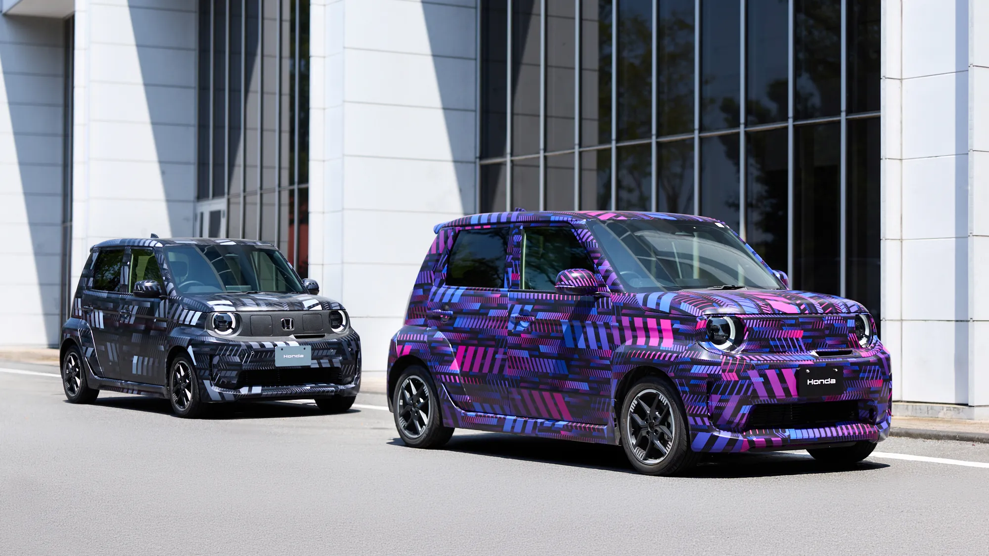
―At the end of its trip around the world, the final design rollout was in Japan. The Japanese version was based on gray and black to roll out in conjunction with its display at the Honda Automotive Technology Workshop, which focused on driving performance and technology.
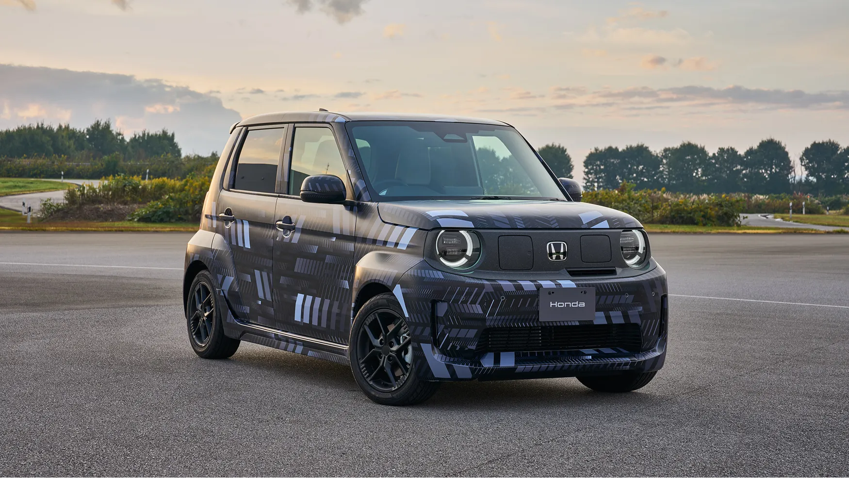
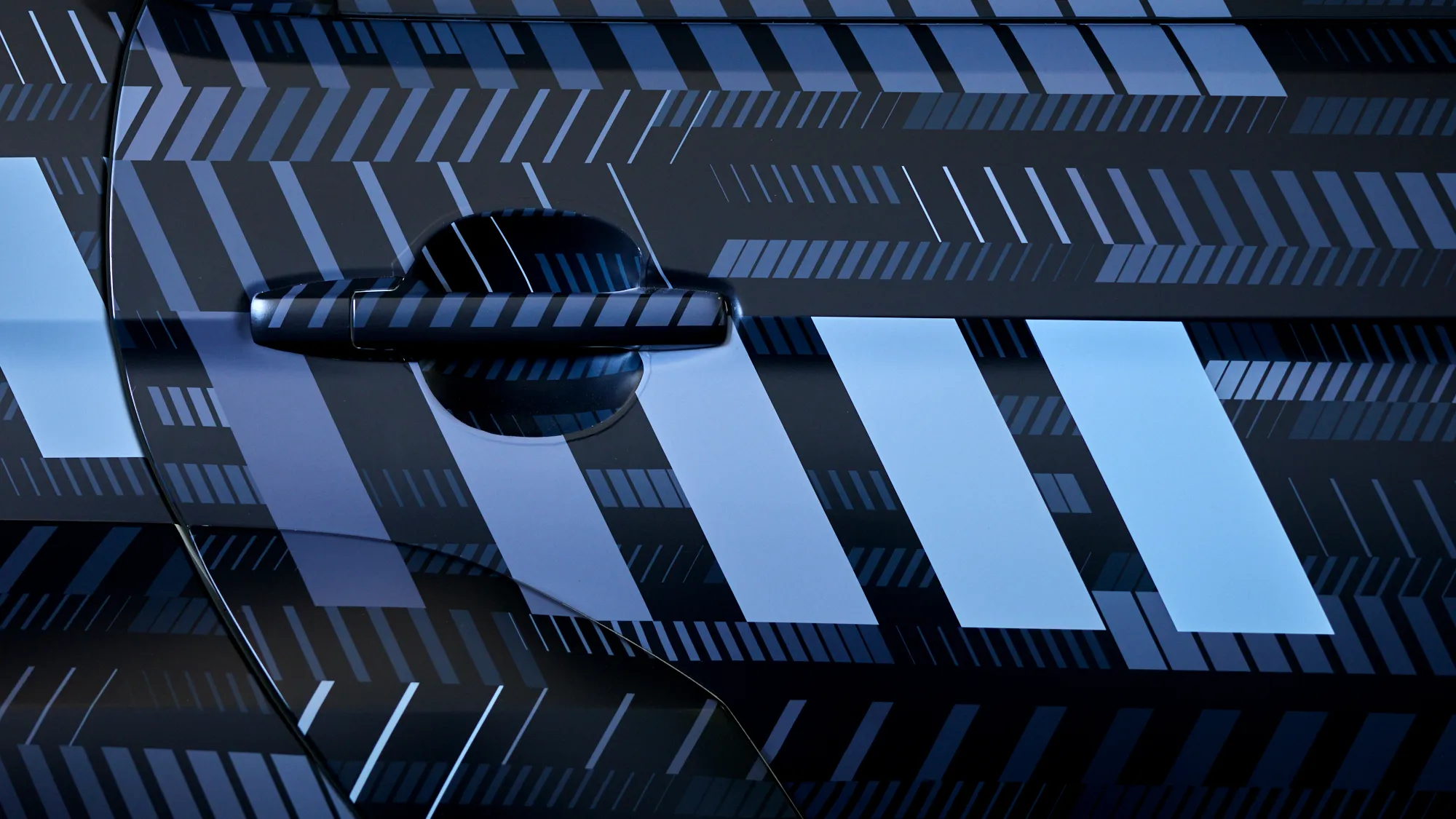
A monochrome color scheme was chosen to emphasize performance and functionality in line with the driving performance and technology theme of the workshop. It was then enhanced to more clearly show movement while maintaining brightness.
In contrast to the full monochrome livery displayed on the new platform next to it at the workshop, this version adds just a hint of purple to the gray to differentiate itself and subtly evoke the original color scheme of the Super-ONE.
Design awareness at all customer touchpoints
Camouflage graphics on wide variety of merchandise
―Before long, the Super-ONE's camouflage graphics moved away from the car to appear on a wide range of merchandise as well. From Tomica toy cars to acrylic keyholders, earphones, and stickers, new merchandise with the Super-ONE's graphics are arriving all the time.
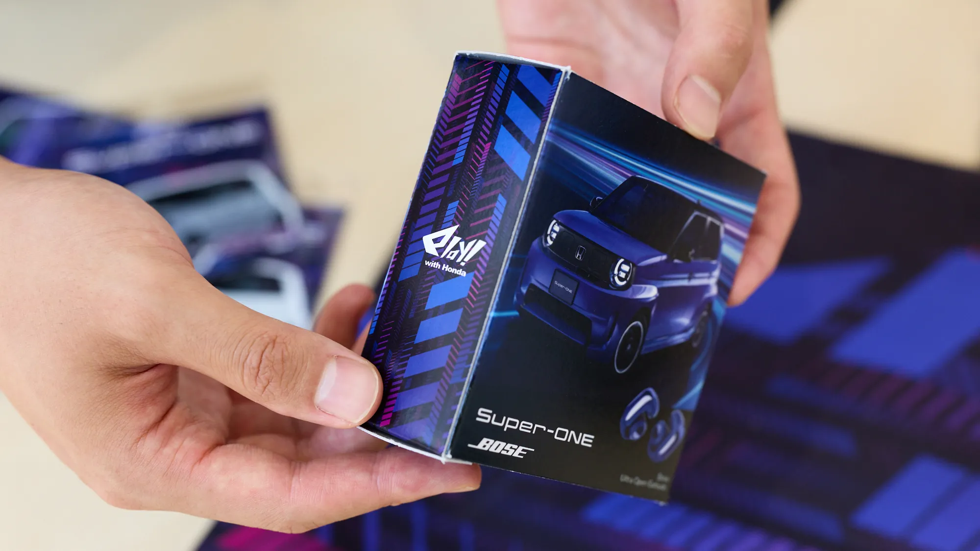
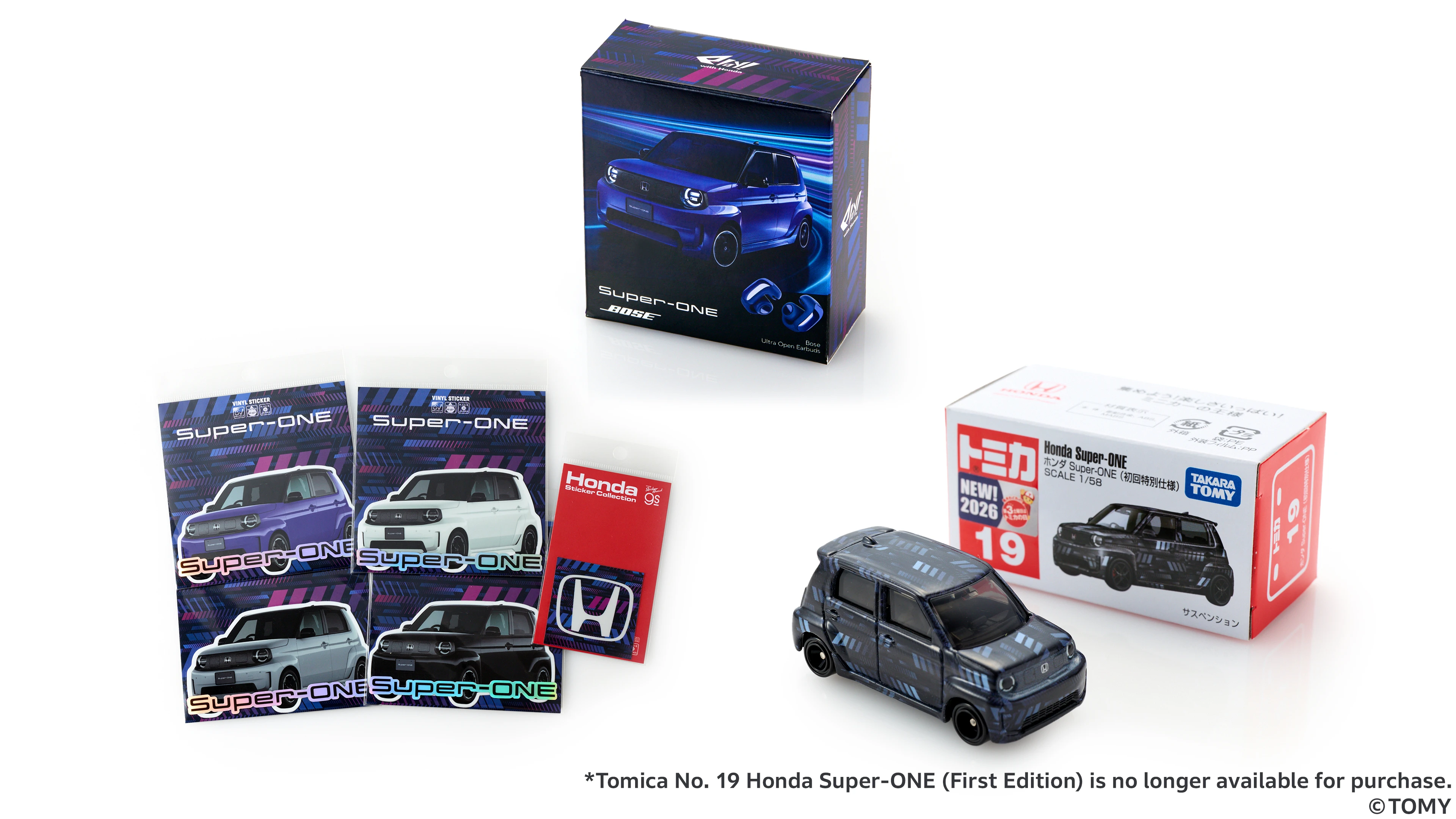
Working with the people in charge of marketing and merchandise on the development side who planned and brought to life a range of merchandise, Nagai supervised the work, as the designer, to ensure the merchandise embodied the image of the Super-ONE. The aim was to convey the worldview of the car through customer touchpoints.
―In addition to the car itself, extending a design across all customer touchpoints—from social media to merchandise—creates a unique brand worldview. Nagai gained this sense of potential from working on the car's camouflage livery. He learned that thinking in terms of a continuum prior to launch, rather than isolated points, gradually builds anticipation. By allowing camouflage livery, originally meant for concealment, to also take on the role of is given the additional role of creating appeal, Honda demonstrates a new approach driven by creativity and imagination.

Profiles

Masaki Nagai
Communication Designer