Until an Emblem is Born
The story behind the making of an emblem celebrating 60 years and 100 million units of Super Cub
Launching the Cub 60 Project
The Cub 60 Project was launched, a joint effort across the different departments, to celebrate the Super Cub’s cumulative worldwide production reaching 100 million units and its 60th anniversary, to thank customers all over the world for loving the Super Cub, and to tell even more people about the Super Cub.
An emblem was to be made, to encapsulate the project’s activities. Around 10 young designers participated in the project. Ito, experienced designer and design project leader fot the new Cub, was in charge.
The Concept
The Cub 60 Project’s aim was to design an emblem, to let more people become familiar with the Cub.
Currently, Cub customers are in a relatively high age bracket. Many in their 20’s do not even know the Cub. The members discussed, and agreed, that they first want the younger generation to get to know the Cub, to become future Cub riders.
To convey an image uniquely Honda, and the Cub’s attractiveness, what is fundamentally needed to be expressed by the emblem?
Before designing the emblem began, the team was given two aspects to consider.
1.
What was the passion the original designers expressed in the Cub?
Why has the Cub continued to be so popular?
Revisiting Cub’s history
2.
What events will the emblem be used at?
What kind of merchandise can it be used on?
What are the possible scenes in which it will be used?
Posters from the past, and an actual first-generation Super Cub C100 were brought to the design floor to explore the Cub’s history, leading to a project team brainstorming session.
What is the styling that is inherited? Where does the Cub’s familiarity come from? Maybe it comes from how easily anyone can ride a Cub.
Why has it sold for so long all over the world? Maybe because it was affordable for ordinary people/ Maybe because it’s easy to use, doesn’t break, and is fuel efficient.
“You meet the nicest people.” What does this mean? It means, you meet the nicest people when you ride a Honda. Bikes had an unrefined image. The Cub changed that.
Why was the Cub so special it was granted a three-dimensional trademark? Is it because the shape has not changed for so long? Is it because the Cub’s shape is so widely recognized?
Developing the Design
● Iconizing the Cub
As the only form of mobility granted a three-dimensional trademark, we thought the characteristics of the Cub should be simplified, iconized. We considered the front view, the side, and many other angles from the first-generation to the latest model.
We settled on the front view, as the Cub’s cute expression would encourage “face to face” communication with many people.
● Usage of the emblem
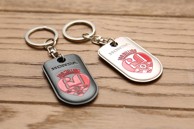
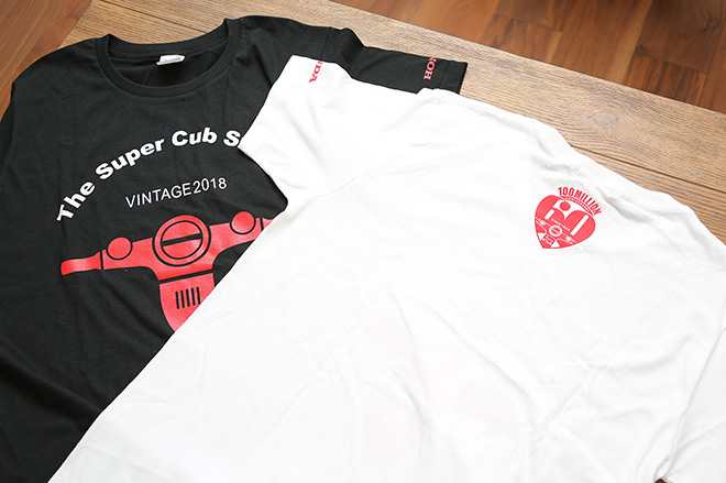
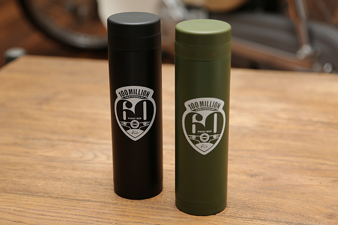
Project members brainstormed how the emblem would be used. What items it would look natural on. The team decided on items that are seen, or used, in everyday life: T-shirts, postage stamps, magazine covers, web sites, key rings.
Many items meant a lot of work, but the team’s motivation rose each time a novel idea came up.
● Narrowing the Selection
Many designs were prepared, and as each design was brushed up, it was time to narrow the selection.
The problem was, each project member had a strong passion for the Cub, so when asked which design they liked best, they inevitably chose their own.
To choose the final design, the team revisited and clarified the concept, and took a vote.
Back to the basics of what the emblem should express
1. The Cub’s characteristics
A simple Cub image
2. Familiarity
Wanting to get to know the Cub better
3. Anniversary
60 years of Cub, 100 million units produced worldwide
4. Usability
Wide range of PR use
5. Global
Messaging applicable worldwide
The vote focused the entire team’s passion, and two designs - Mori’s “60” silhouette design and Kuriki’s heart motif - remained.
I deigned the emblem using elements such as “60” as a silhouette and the Cub as line art within, and balancing these elements. I had this concept in mind from the start, so I was glad it was a finalist.
Symbolizing the Super Cub, loved all over the world, in a way that anyone could understand, and smile? It had to be a heart. I patted myself on the back when I realized how well “60” fitted in to the heart.
● Final Presentation
The two finalists further refined their designs for a final presentation. After careful consideration, Kuriki’s heart motif became the project’s official emblem.
Both designs expressed the Cub well, and it was hard to drop either. One of the passions of the Cub 60 Project is to show gratitude to our customers, and have more people know the Cub, so we felt Kriki’s heart emblem was an idea that could express the Cub’s attractiveness to a global audience.
Simplifying “Anniversary,” “100 million,” “60th” and the Cub’s silhouette and giving the emblem familiarity with a heart motif, was a difficult challenge.
Everyone likes a different aspect of the Cub, meaning the Cub has such a wide appeal. Concentrating the Cub’s appeal in one emblem was a difficult task. The deciding factor in selecting Kuriki’s design, the heart, was a typically “Cub” outcome.
Designing Sample Items
-
1 / 3
-
2 / 3
-
3 / 3
Many people from a wide array of departments discussed and contributed to the designing of the commemorative emblem. Through this project, the team was given a wonderful opportunity to look back through Honda’s history, learning the passion the original designers poured into the Cub, and Honda’s approach to developing products. The team hopes that customers will feel the gratitude through the finalized emblem.
100 million units, and 60 years is only one step in the Super Cub’s history. It will continue, and we hope customers look forward to more of the Super Cub, and Honda Design.
Kyosuke Kitayama, Design Manager