
Why Create an Original Font?
Background to the Development of the Honda Global Font

Consistency as a Brand to Shape the Future
―In 2023, Honda redefined its Global Brand Slogan (GBS) by adding the phrase "How we move you." to its original tagline, "The Power of Dreams." At the same time, the company began developing its own unique font. Why did you feel an original font was necessary?
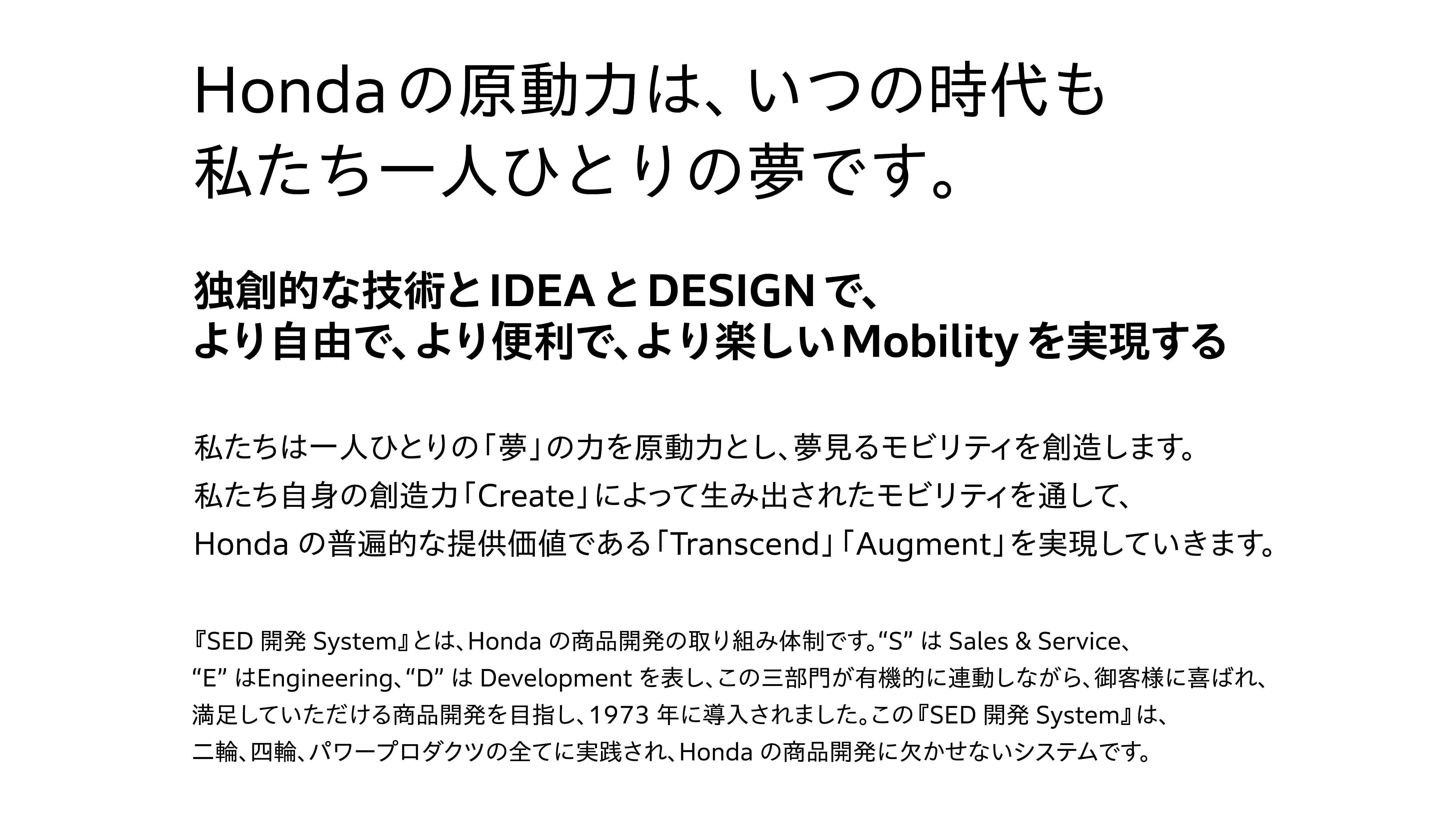
Starting with the redefinition of the GBS, we have expanded brand assets such as the Honda Brand Movie and the Brand Playbook, our internal manual, to achieve consistent branding. We believe that developing and using Honda's original font across the various assets we continue to deploy is essential for enhancing brand consistency.

Shared Monozukuri Craftsmanship with Development Partner Morisawa
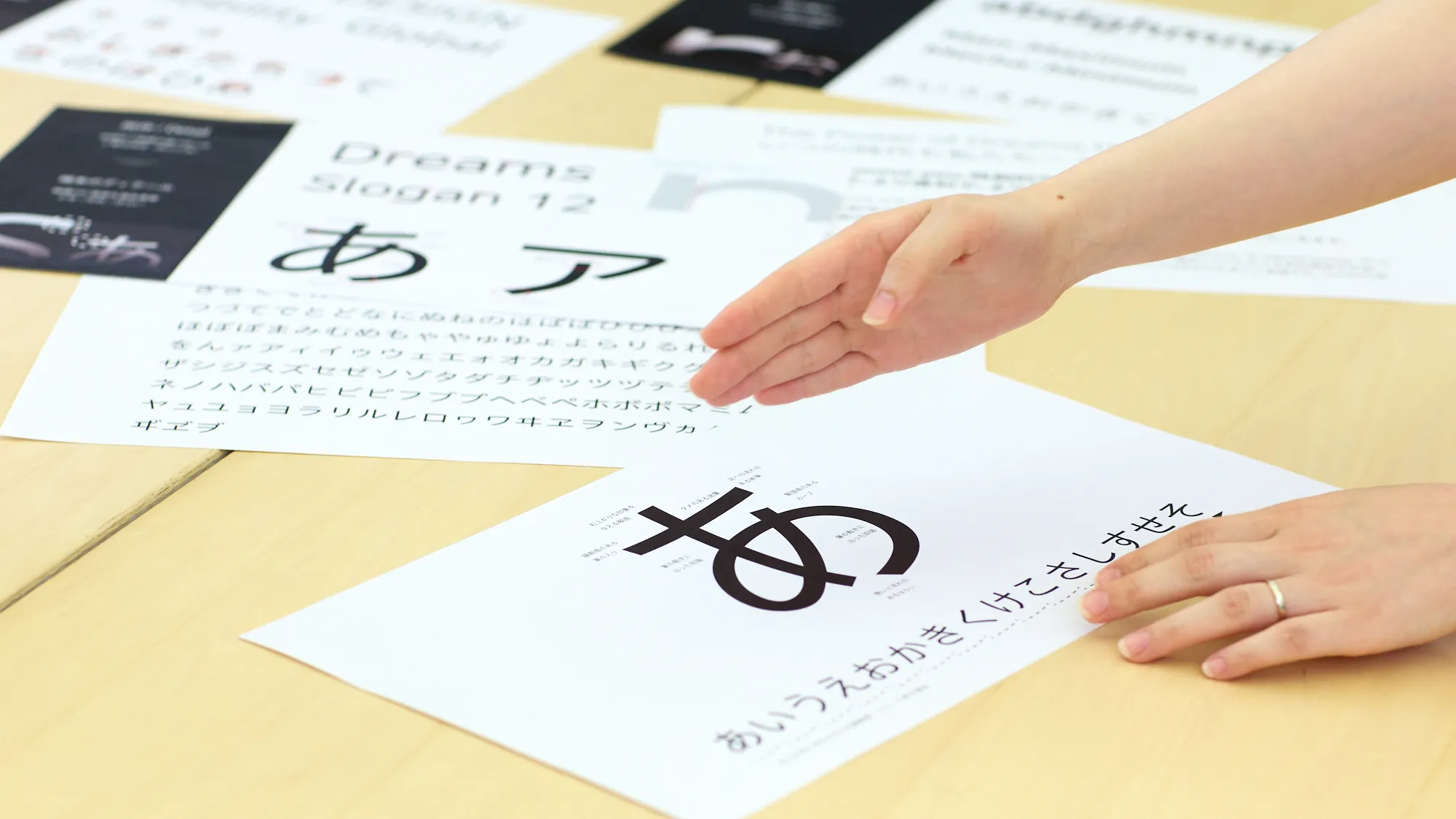
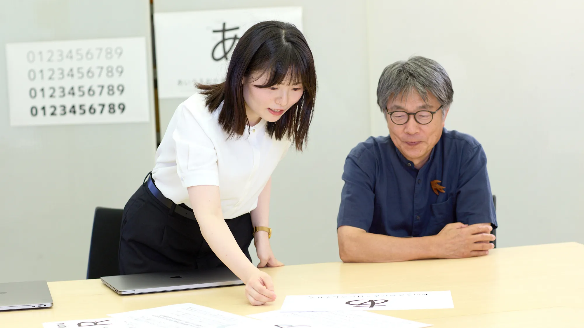
―What kind of team structure and process did you use to develop the font?
Oishi
Four designers from Honda's Brand Communication Center, including myself, participated. We engaged Ms. Taruno for the development of the Latin font and Ms. Honma for the Japanese font, both from Morisawa. Mr. Torinoumi from JIYUKOBO supervised the development of the Japanese font.
Regarding the production process, we began investigating our internal font environment and usage patterns around autumn 2023. At this time, we initiated contact with Morisawa. While they proposed several directions based on existing fonts, we also explored our own concepts. We officially commissioned Morisawa and began font development in summer 2024. We designed the Latin font first, and then proceeded with the Japanese font design.
―Mr. Torinoumi, you have a 45-year track record as a typeface designer, but I understand that you aspired to be a car designer in your teens.
Torinoumi
I have loved cars ever since I was a child. I will never forget the joy of riding in my relatives' car when I visited them in Nagoya. I also admired racers and mechanics, and built nothing but car models, so I was thrilled when a 1:12 scale Honda F1 car was released. That is how I ended up entering art school with the goal of becoming a car designer. I was unable to become a product designer, but while studying graphic design, I encountered the world of typography and became a typeface designer.
―Both car and typeface design rely heavily on delicate line sketches, and there seems to be a shared approach to design philosophy.
Torinoumi
I feel this font development project progressed smoothly once the concept was finalized because Honda follows an iterative monozukuri (art of making things) approach. Those involved gathered input from employees in other departments while making each decision carefully yet swiftly, so I was truly impressed.
Design of the "O" That Formed the Foundations of the Concept
What Is a Versatile Font?
―What concept guided the development of the font?
Oishi
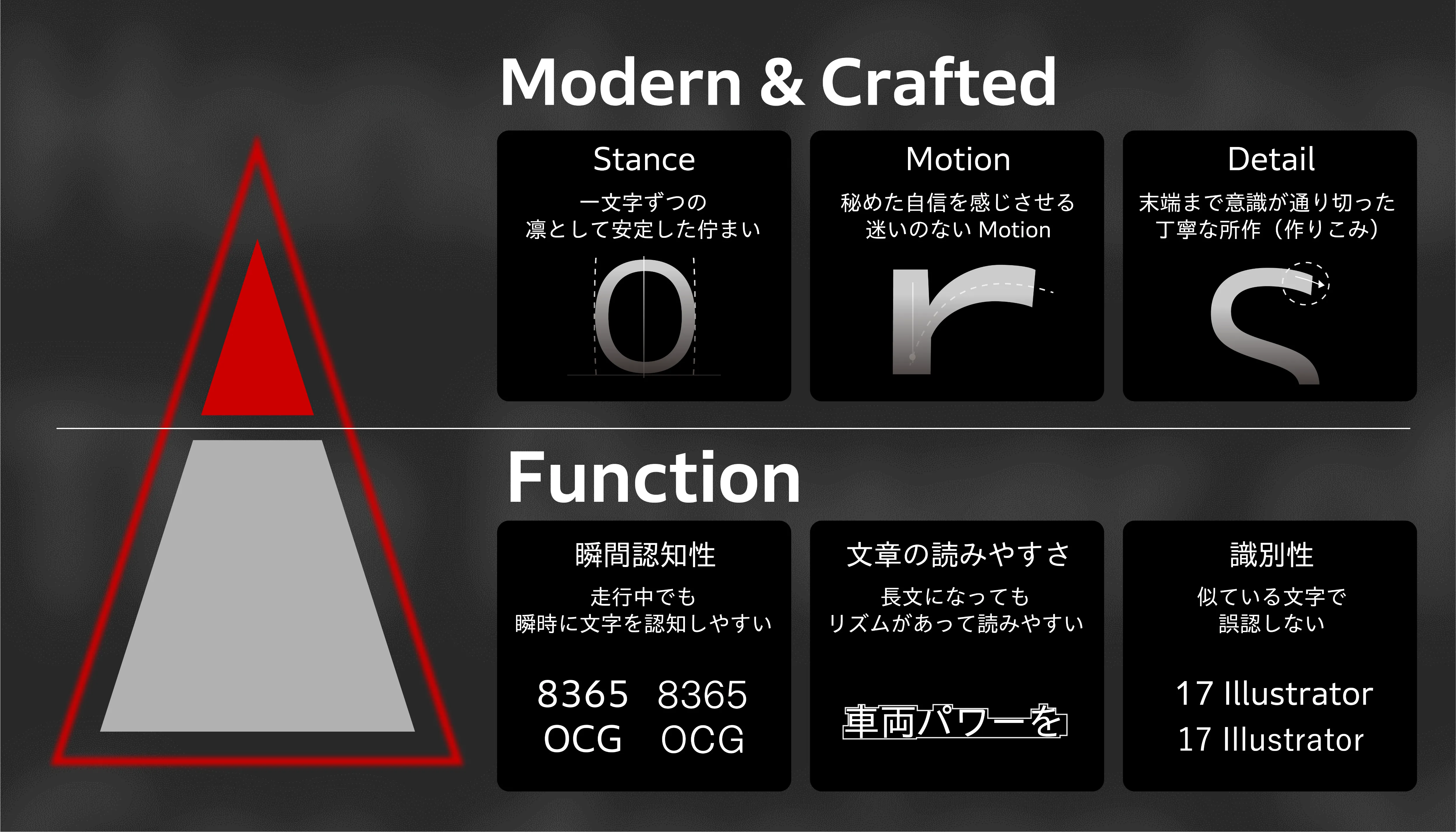
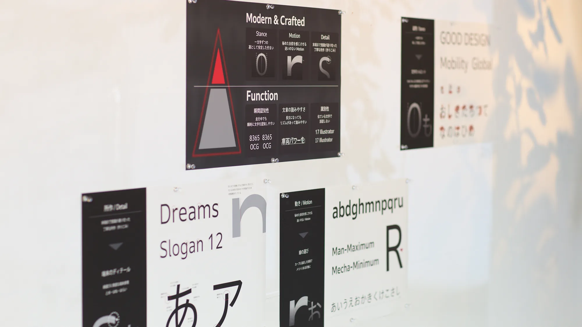
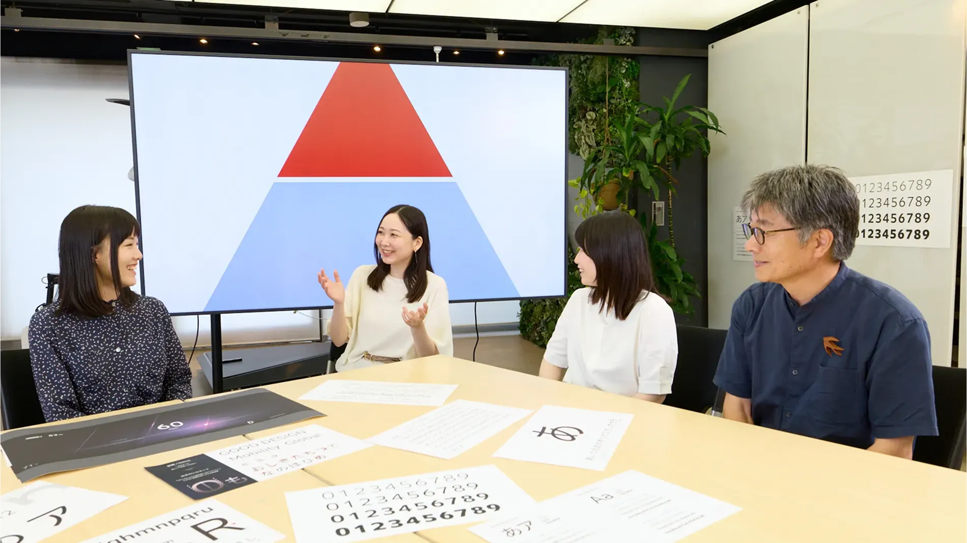
At the heart of Honda's monozukuri philosophy lies human-centric thinking. Building on the essential functionality required of mobility, we established a grand concept for a font that evokes the strong resolve of each individual. As for "Function" elements, we prioritize three key aspects. These are instant recognizability and distinguishability—essential for use in automobile and motorcycle instrument panels—and readability in longer texts.
Oishi
In terms of the font's "Modern & Crafted" individuality, we developed the design from the perspectives of "Stance," "Motion," and "Detail." Specifically, we aimed to create a font that conveys a poised and stable presence in each character, unwavering strokes that suggest quiet confidence, and meticulous craftsmanship evident in every detail—resulting in an overall impression that is Modern & Crafted.
―I heard it took some time to finalize the concept. What kind of trial and error did you go through?
Oishi
To create an original, versatile font that could be widely utilized across communication and product domains, we needed to establish a solid concept for what Honda should aim for. Since functionality encompasses various perspectives, we had extensive discussions within the team, asking questions such as "What kind of functionality is Honda looking for?"


Oishi
Developing a font suitable for both products and communications presented a dilemma. The more we pursued functionality, the more mechanical it became; the more we emphasized individuality, the more its functionality weakened. Finding the perfect balance that met Honda's standards was a tough yet enjoyable challenge.
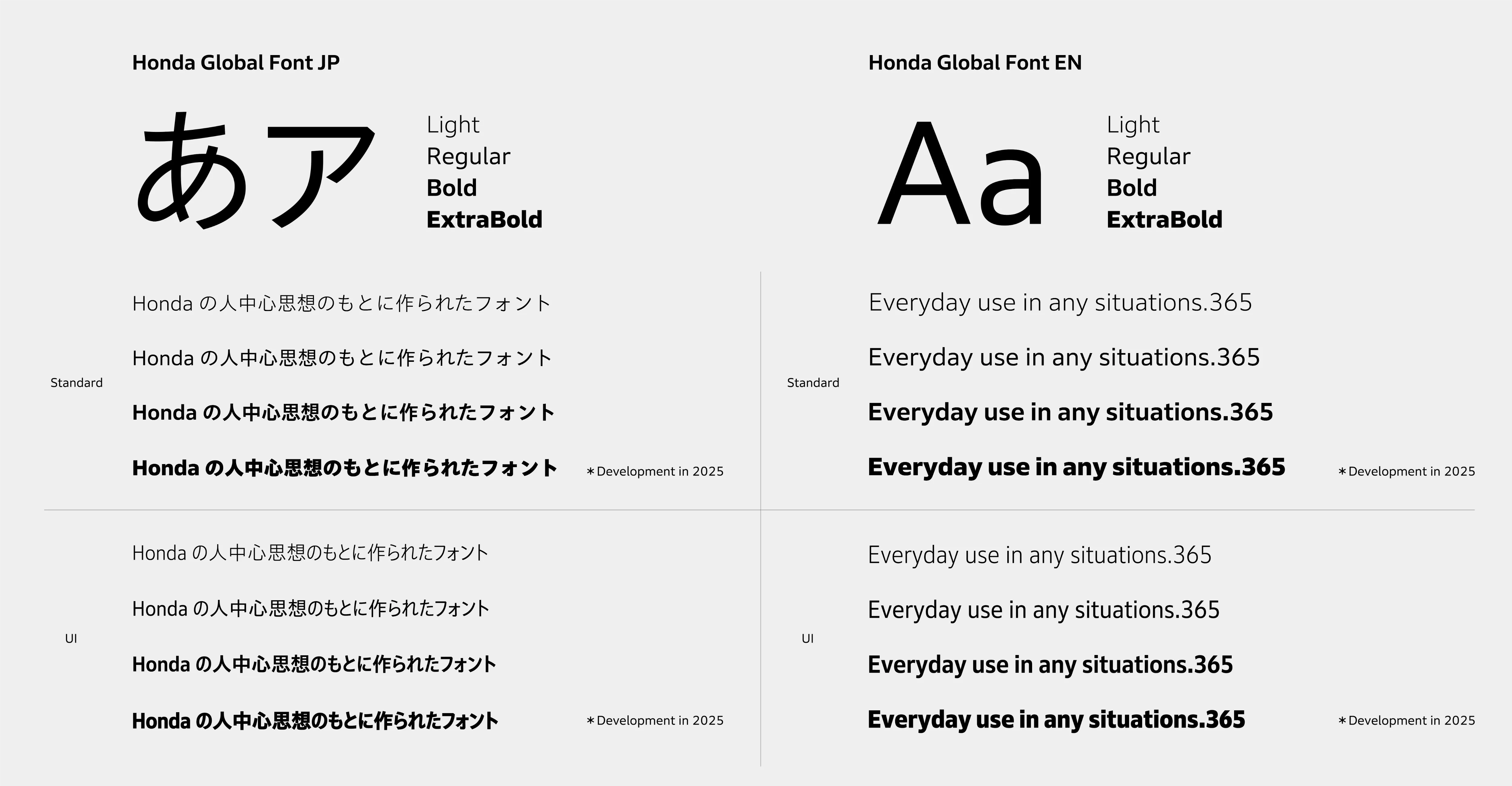
―The base Morisawa Fonts selected are Clarimo UD PE for the Latin font and Aoto Gothic for the Japanese font. What criteria were used for this selection?
Oishi
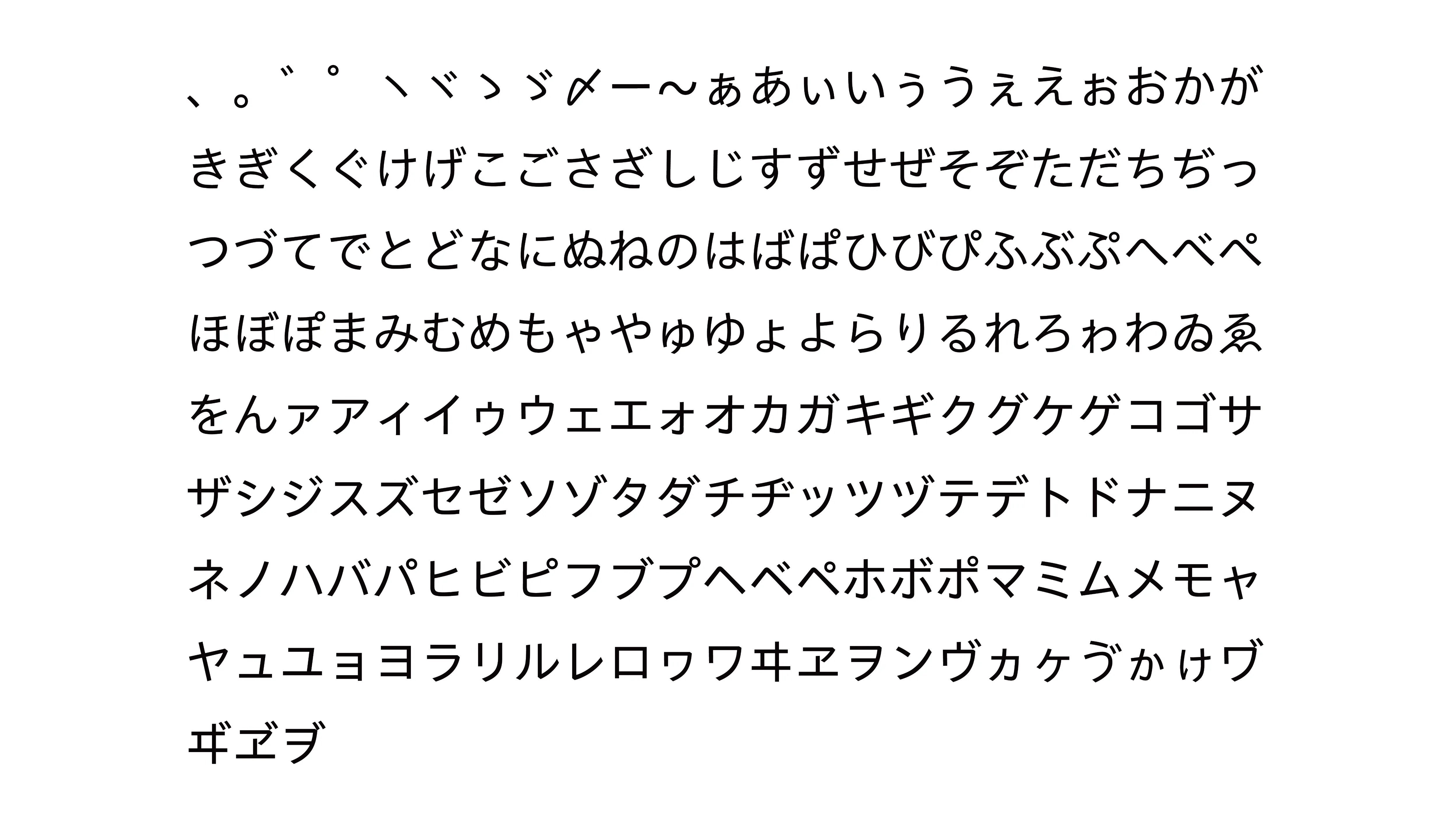
The key selection criteria for the Latin font were readability in longer texts and versatility for multilingual use. For the Japanese font, we considered TBUD Gothic, which has slightly stronger universal design elements, but ultimately chose Aoto Gothic for its natural impression with retained handwritten nuances.

Latin and Japanese Font Design, Infused with Honda's Distinctive Character
Even a Single Number Creates Various Discussions
―What aspects did you focus on to create functionality and individuality that are characteristic of Honda?
Taruno
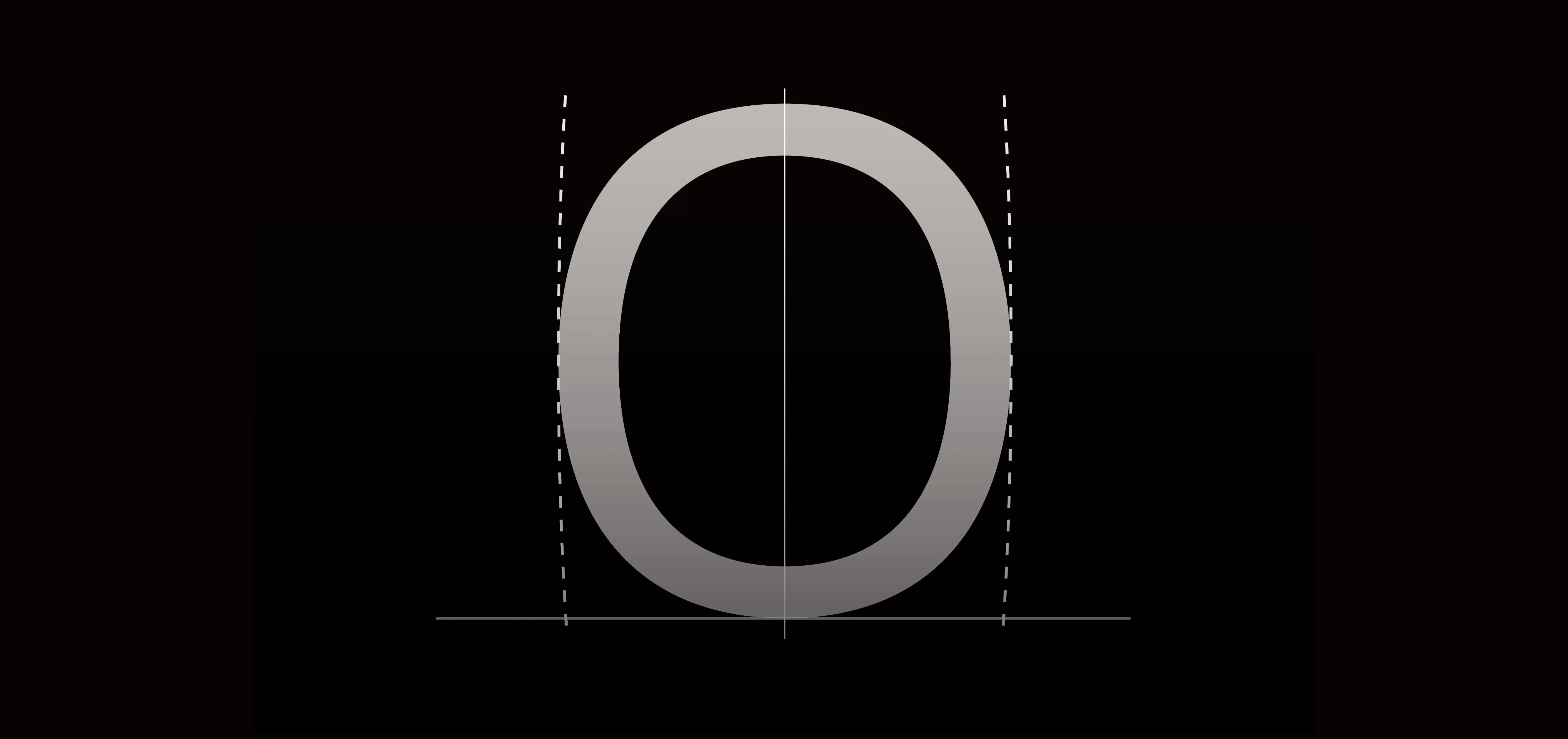
The design approach for the Latin font focused on leveraging the strengths of Clarimo UD PE while achieving the tautness represented by the letter "O."
Torinoumi
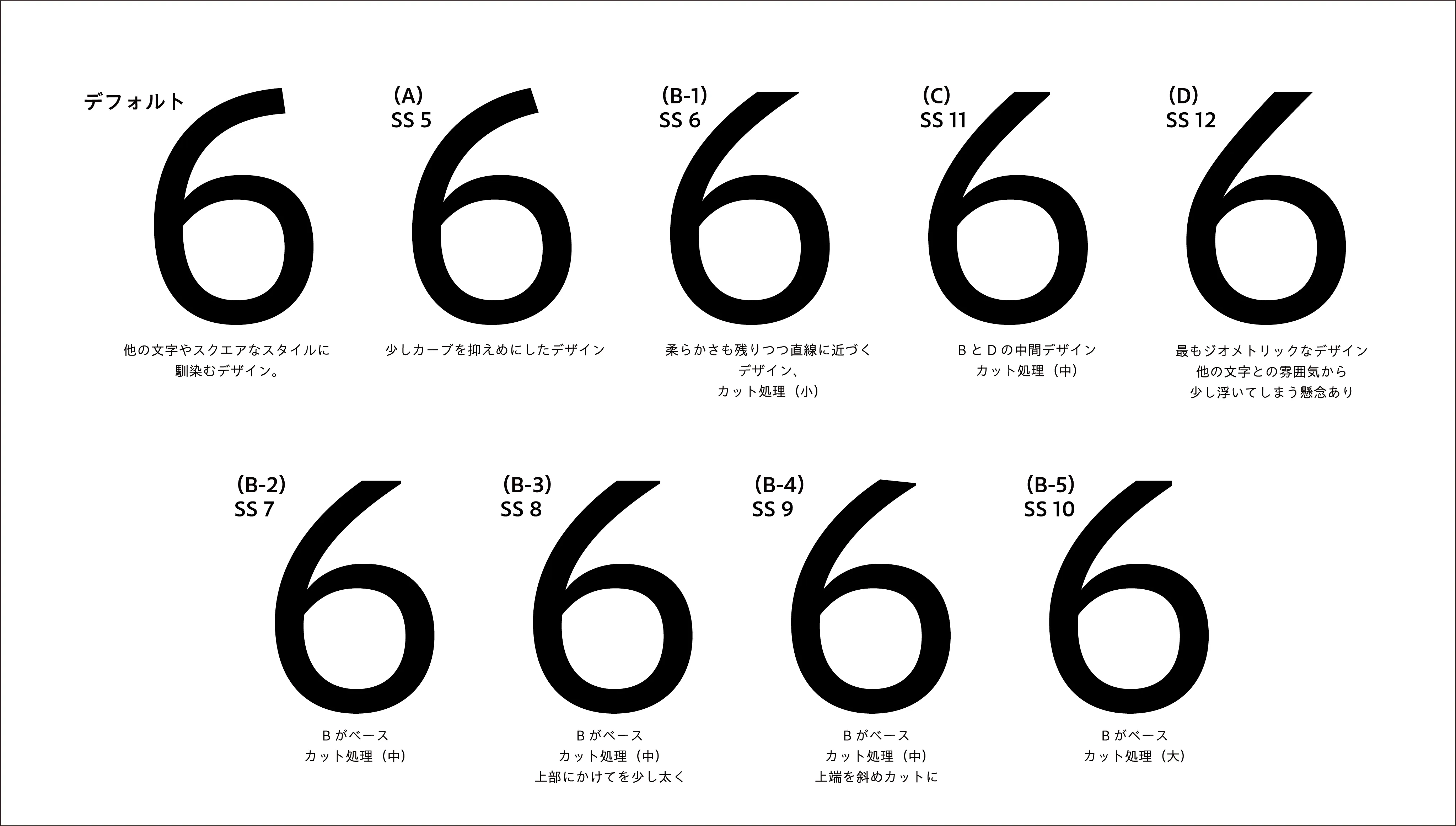
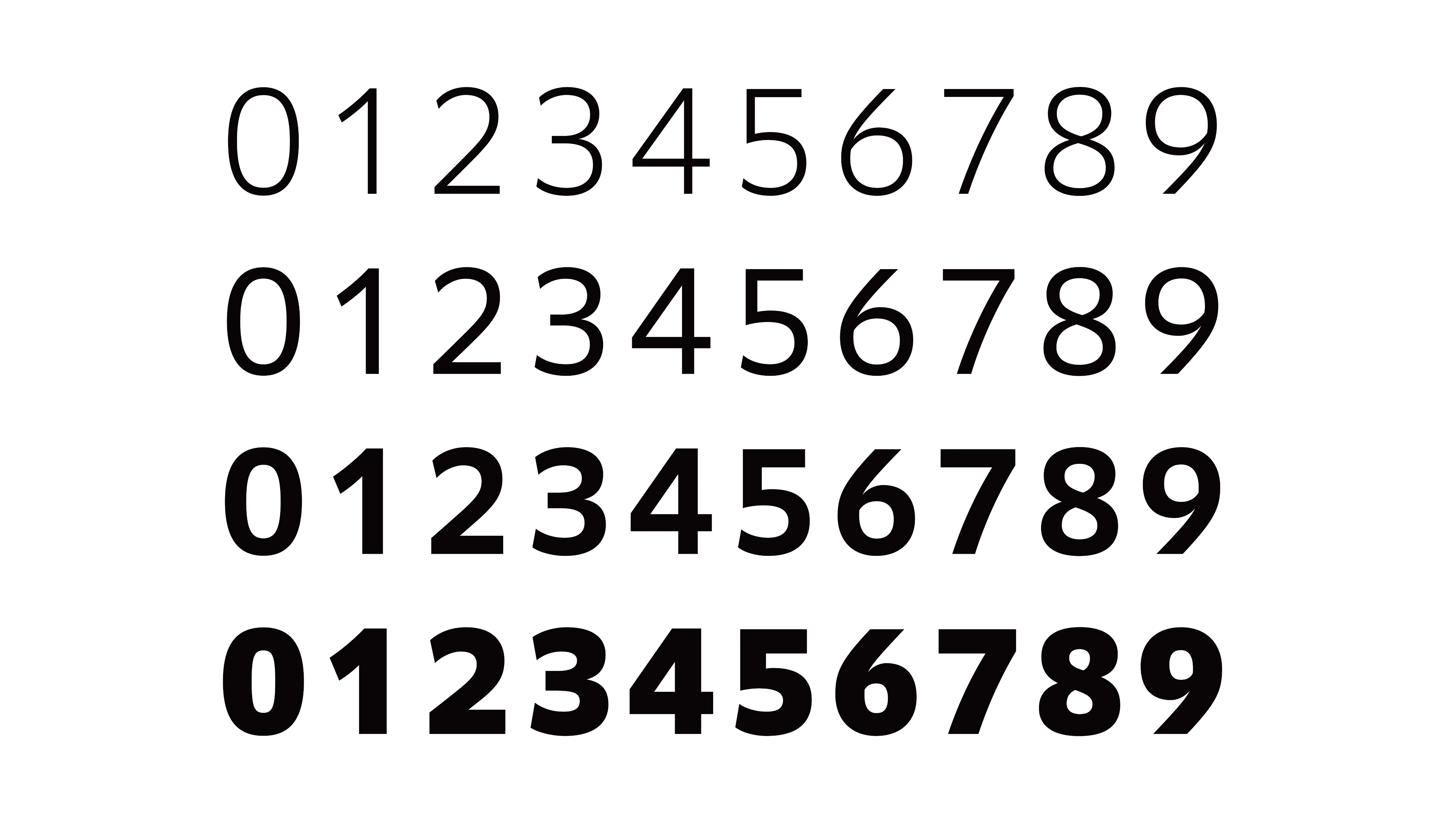
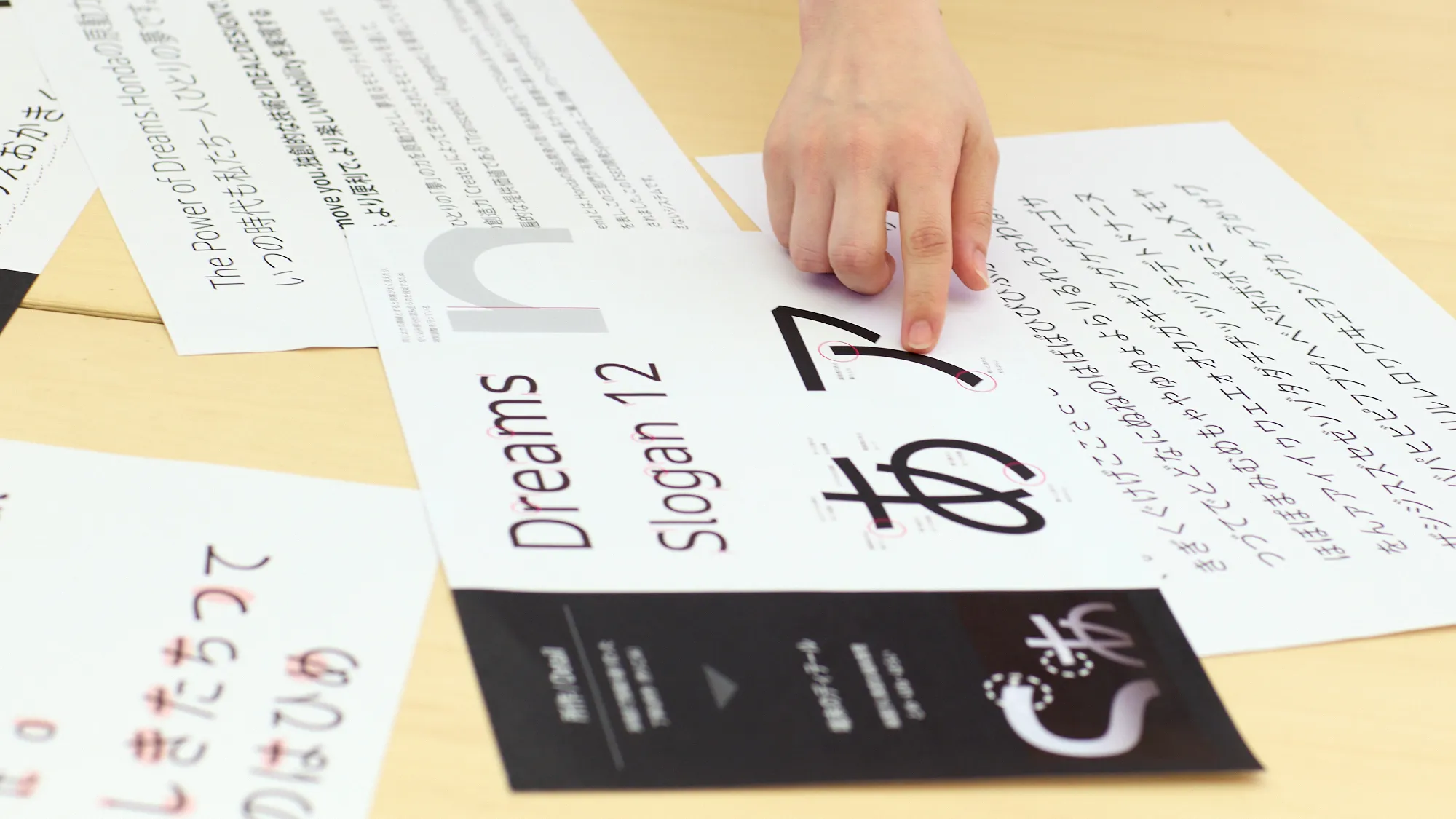
The numbers "6" and "9" were particularly interesting. We printed them in instrument panel format, stuck them on the wall, and collectively verified their visibility before finalizing the design.

Taruno
The alphabet is designed in a square style, but numerals retain the feel of the letters while incorporating slightly geometric elements. Since the numerals carry overwhelming significance when displayed on a panel, we paid close attention to them from start to finish.
We created multiple prototypes to determine the shape, proposing nine variations with different curls and top-edge cuts. Ultimately, the design with the smallest curl and no top-edge cut (D in figure on the left) was chosen. Here too, I sensed Honda's keen aesthetics and attention to detail.
Taruno
In addition to the numerals, the lowercase letter "l" was another element we carefully refined until the very end. While we wanted to distinguish it from the uppercase "I," its inherently simple shape left limited options. Overdoing it would have disrupted the overall balance of the typeface. Therefore, we designed it with a slightly curved lower part for differentiation, aiming for a degree that minimizes disruption when typesetting text.
Oishi
The lowercase "l," which can often appear bland, now conveys a soft yet powerful feeling. I believe that whenever people use it, they can feel they are using Honda's corporate font. Additionally, by raising the center of the "M" and performing other adjustments, the overall shape of the letters was made sharper while avoiding an excessive heaviness.
―What aspects did you focus on when designing the Japanese font?
Torinoumi
The base font, Aoto Gothic, features slightly smaller characters, making it easy to read long texts with many characters per line. However, when displaying short phrases within the instrument panel, they can look visually scattered. Therefore, kanji characters were slightly enlarged and adjusted accordingly.
Honma
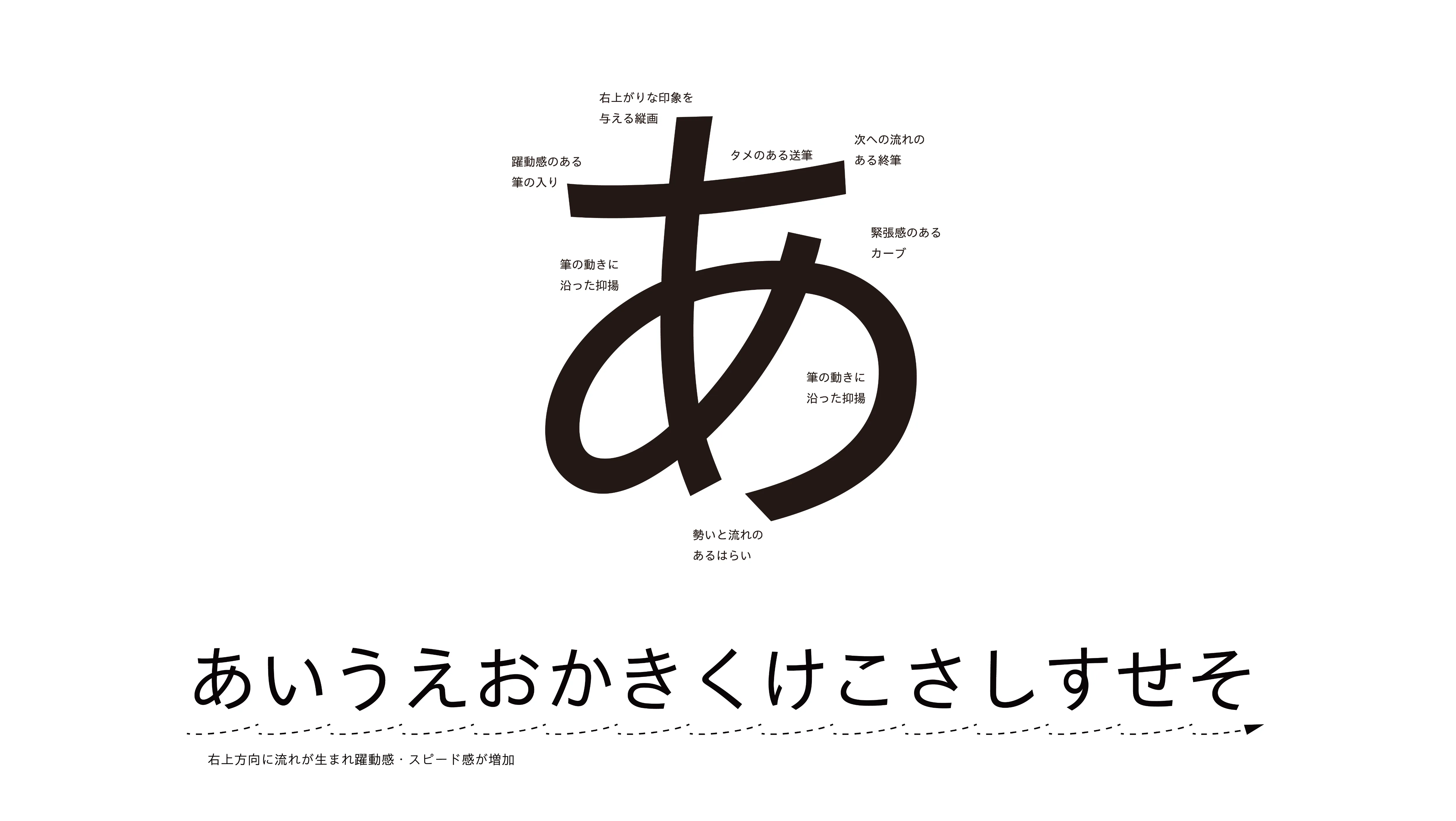
When creating the Japanese font, we pursued the ideal balance between Modern & Crafted. When designing typefaces, prioritizing stability tends to result in overall geometric, square proportions. Conversely, emphasizing handwritten qualities introduces variation in size and balance, creating a rhythmic expression. We refined the design repeatedly to achieve a delicate balance that maintains readability and stability while retaining a human touch.

Oishi
At the time we were developing the Japanese font, the Latin font was nearing its final design phase and was starting to take on a distinctive character. The Japanese font proposal at that point obviously met all functional requirements and blended smoothly when combined with the Latin font. Yet somehow, it looked too clean and crisp. We felt it needed one more refinement, so we decided to incorporate shapes that conveyed the energy of handwritten text.
Honma
Therefore, we tilted the horizontal strokes slightly upward to the right, adding tension to the curves. By giving the lines variation and thickening the points where pressure is applied when writing by hand, I believe we were able to convey a sense of humanity and craftsmanship.
Torinoumi
I often talk about how text turns out when written with a brush, but factoring in the bending of sheet metal was a learning experience. This perspective from an automobile company designer was both surprising and fascinating to me.
Using the Same Font Like "Eating from the Same Pot"
A Shared Understanding of the Brand Cultivated Daily
―Use of the Latin and Japanese fonts has begun in Japan. In May 2025, the Honda Global Font was simultaneously installed on the computers of all employees. What impact do you think this will have on internal branding?
Oishi
It offers the convenience of being a reliable default choice. However, we also believe that people can sense that even everyday typefaces embody Honda's identity and intent, and that this font can help build a shared understanding of the brand. We hope that Honda employees will use the font in the materials they create and experience an improvement in brand quality.

Taruno
The typefaces we use in daily life are usually unremarkable and rarely attract our attention. However, I would be delighted if the use of the Honda Global Font sparks even a little interest in design and typography among Honda employees. I hope it will eventually become something like a shared language for all of them.
Honma
I heard that the Japanese font I worked on will be used for communication in various Japanese-language contexts and included in products. I understand it may also be incorporated into automobiles in the future. If this font can serve as the "voice" that conveys the concept of a car, I would be thrilled.
Torinoumi
For all of you working here, I believe use of the Honda Global Font is a bit like "eating from the same pot." While the original saying refers to the sharing of both hardships and joys, the use of the same font by people from various departments also carries a similar meaning, does it not? And lastly, typefaces are cultural expressions. I hope you will continue to treat the Honda Global Font as a foundation of your culture, refining it over time to suit the evolving environment.
Profiles
Rumie Oishi
Communication Designer

Sakura Taruno
Typeface Designer (Morisawa Inc.)

Yuka Honma
Typeface Designer (Morisawa Inc.)
Osamu Torinoumi
Typeface Designer (JIYUKOBO Ltd.)