What kind of model is the PRELUDE, returning after a quarter of a century?
The name “PRELUDE” is making a comeback in Honda's lineup after more than a quarter of a century since the fifth generation model was released in 1996. What is the meaning behind this model?
Tomoyuki Yamagami
The word “PRELUDE” comes from the opening of a piece of classical music; in other words, it symbolizes a new beginning or an introduction. We hope that the new PRELUDE will also become a sports car that heralds a new era and redefines the joy of driving in a way that makes you want to keep going.
What kind of model did you have in mind when the return of the PRELUDE was decided?
Yamagami
To be honest, we didn’t develop this model with the initial intention of reviving the PRELUDE. We were looking for a way to create a new sports model that would be suited to the modern age, and the name PRELUDE just seemed to fit perfectly. That's why we decided to make it a car that is in tune with modern technology and values, rather than simply reproducing a car from the past.
What kind of values were you seeking as a PRELUDE for a new era?
Yamagami
It's inevitable that the response tends to focus on the heritage aspect, but we didn't want people to be swayed by this kind of preconception.
This PRELUDE is not a “do-over” of the past; rather, we carefully studied the positive aspects of past models to ensure that they were carried forward, while also focusing on evolving them in a way that is appropriate for the modern age. There are aspects that incorporate current trends, but we also didn't want to go too far in that direction. Finding that balance is important in this day and age.
The characteristics of the PRELUDE have changed over the years, but what has remained the same is its sportiness and specialty (sense of specialness). Another important point is its spirit of tackling new challenges, always actively incorporating the latest technology of the time. This new model also inherits the PRELUDE's characteristics while also exploring what a sports car should be in a new era.
Those who remember the 80s and 90s may have an image of PRELUDE as a car for going out on dates.
Yamagami
Dating has changed over the years, but I think the essence of it has remained the same: spending special time with someone.
In that sense, the PRELUDE is a car that lets you enjoy special moments in a variety of situations. When you think of a sports car, you think of something sharp, like an F1 or a fighter jet. However, I think the theme of this model is closer to the image of a glider that glides through the air with a sense of freedom.
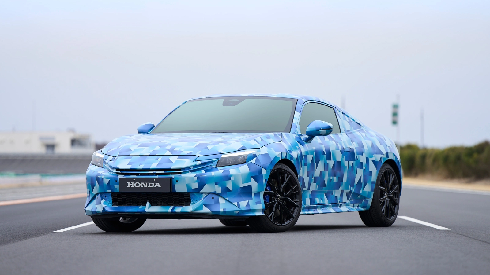
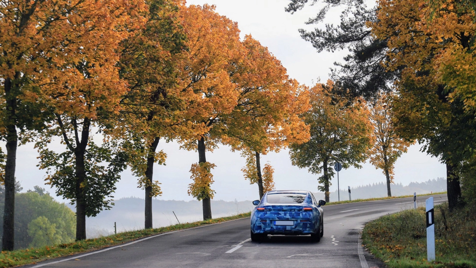
What is the significance of the camouflage wrapping?
The development vehicle for this PRELUDE model has been wrapped in camouflage. Generally speaking, the purpose of camouflage is to make it difficult to see the details of the design. Why did you add this design element?
Yamagami
It's true that the purpose of camouflage is to hide the design of development vehicles. However, since the PRELUDE concept model was unveiled at the Japan Mobility Show 2023, and the design was to some extent already public, there was no need to hide it completely. Therefore, the camouflage was also intended to be a form of disguise for the purpose of showing, designed to get more people to feel the story and concept behind the PRELUDE.

How did you decide on the direction of this camouflage design?
Yamagami
We already had a good understanding of the concept and the values we wanted to convey, so I didn't give detailed instructions about the design. Instead, I said that I wanted it to be something that makes people want to stop and take a photo of it. Camouflage is supposed to be inconspicuous, but in this case, the mission was to create something that was inconspicuous yet eye-catching at the same time. That's why we needed a design that would attract attention, rather than just camouflage.
Morioka
Sakura Morioka: We started by coming up with ideas as a team. We didn't set any restrictions at first, allowing us to think freely about designs that would suit the PRELUDE. As a result, we came up with a wide variety of ideas, including designs based on previous PRELUDE models, designs that emphasized sportiness, and designs that incorporated abstract patterns.
How did you narrow down the ideas to decide on this design?
Morioka
We started by categorizing the ideas, organizing them from the perspective of things that had a strong impact when you first saw them, things that had a story to tell, things that were closely related to previous PRELUDE models, and things that had a strong sense of the new PRELUDE. We then narrowed down the ideas while receiving feedback from Mr. Yamagami.
Yamagami
As the development manager, I have to make decisions when the situation calls for it. However, sometimes my comments end up influencing everyone else's opinions.
In particular, when it comes to a creative field like design, I don't think you should simply decide based on personal taste. I felt it was important to carefully consider things like what the designers were thinking when they proposed this design, and what message they were trying to convey.
I did actually convey my thoughts at the time, but I was conscious not to give any specific instructions about what I did or didn’t want. However, thinking back to that time, I remember that we were talking about things like “I wonder about this, because...”

Morioka
When we came to the final design, it went smoothly without any particular problems. It felt like the decision was made in a very natural way.
Yamagami
I think the design that was ultimately chosen is the one that most closely matched the grand concept—not just the camouflage, but also the approach to overall design and dynamics. The team members were also working with that image in mind.
A good design is one that you gradually feel was the right choice after you've made it. Sometimes you realize the correctness of your choice as time goes by more so than when you first made it. Even now, when I look back, I think that this design was the right choice.
Thoughts behind the blue gradation
The beautiful gradation is an eye-catching design. How was it constructed?
Morioka
Based on the idea that Mr. Yamagami mentioned earlier of a car that lets you enjoy special moments, like dates, in a variety of situations, we started the design process by asking ourselves, “What is a date?”
We didn't just want to create a car for couples on a date; we also to wanted to re-examine the concept of dating in the modern age, ultimately concluding that the essence of dating is sharing special time together.
When you think about it like that, a date isn't limited to lovers, but can also include married couples, parents and children, grandparents and grandchildren, siblings, close friends, and even the relationship between you and your car. The more I thought about the design, the more convinced I became that the new PRELUDE would create a space for spending special time.
Did you actually go out on a drive while you were thinking about this?
Morioka
I was wondering where people would want to go in the PRELUDE, and my boss recommended the Nishiizu Skyline, so I went there.
As I drove, enjoyed the scenery, took photos, and just generally enjoyed the trip, I was reminded of how enjoyable it is to go somewhere in a car. When I stopped at Michi-no-Eki roadside stations, I had the chance to talk to all sorts of people, and I was fascinated by the cars parked there. These small discoveries added up and made me realize that there was more to it than just getting from point A to point B.
I was inspired by this experience and ended up going on a trip every weekend to further explore the concept of scenery that can be found in the most distant places. The sky, lakes, rivers—all of these landscapes are special things that only those who have been there can experience. I wanted to somehow incorporate that feeling into the design, so we decided to go in the direction of the camouflage design.
The beautiful gradation is an eye-catching design. How was it constructed?
Yamagami
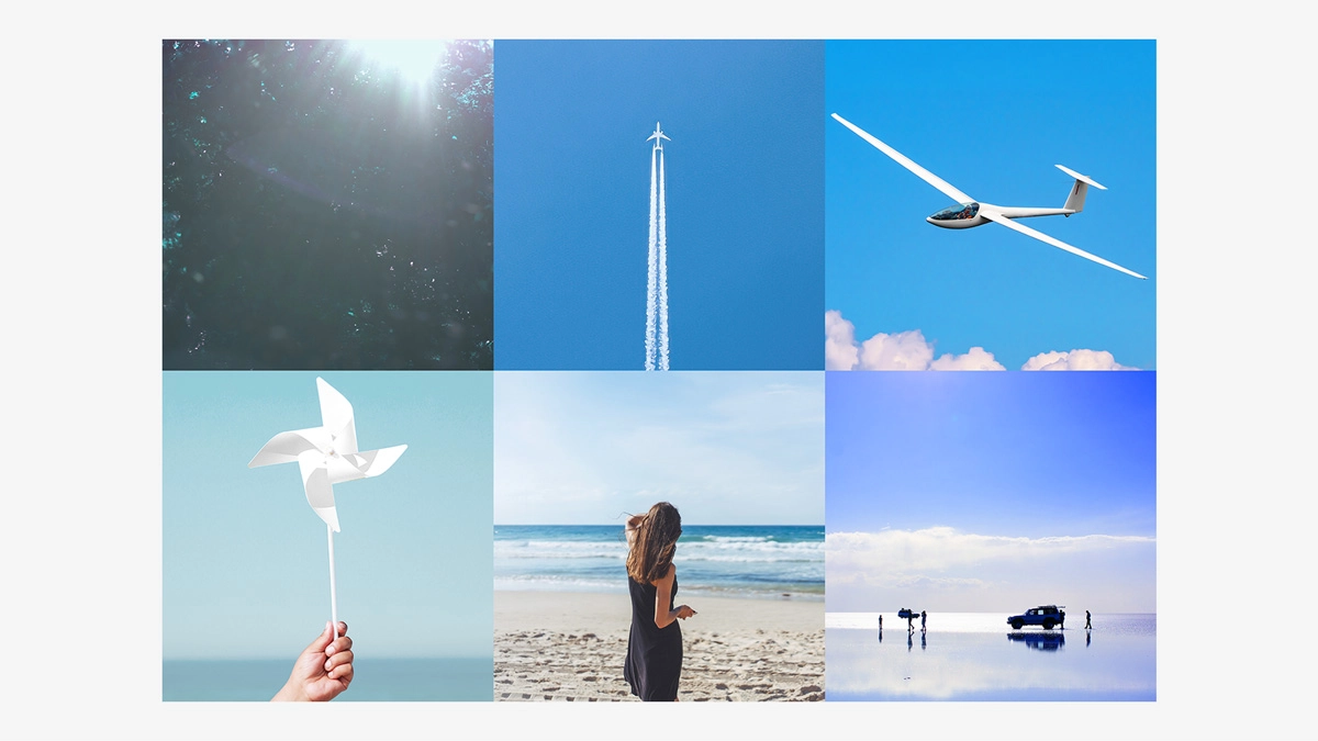
I used to talk about this a lot with my team, but when you look up at the sky and see something white flying through the blue sky, it feels good, doesn't it? Even when you look at the sea, you see white sails swaying in the wind, or a white plane flying in the distance. I wanted to incorporate that kind of natural, eye-catching feeling of pleasantness into the design.
Morioka
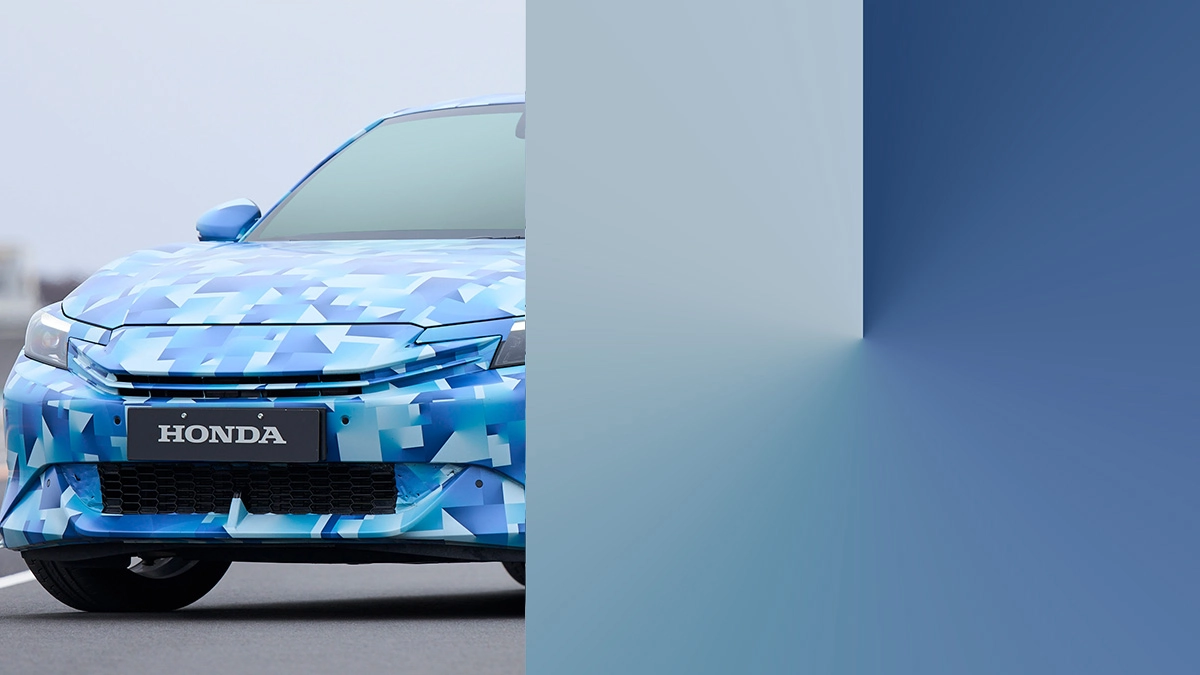
We wanted to express the exhilaration of wanting to keep going, focusing on the image of journeys and freedom of mobility that the PRELUDE has. After a lot of trial and error, adjusting the colors and shapes, we finally settled on a geometric pattern of straight lines and curves, with a base color of white and blue gradation.
One thing that is particularly important is that the elements that are symbolic of the new PRELUDE have been concentrated into a simple form. In particular, the line that runs through the square is also a natural link to the front design of the PRELUDE. The gradation that spreads out from there represents both the desire to keep going and the history that has been built up.
Did you actually go out on a drive while you were thinking about this?
Yamagami
The word “heritage” doesn't just mean nostalgia; it also means the accumulation of time. I wanted people to feel that flowing through the design. Of course, you might not understand this without an explanation, but I wanted to create a design that would somehow gradually draw in the feelings of the viewer.
Morioka
This design may be seen as the sky, the sea or mountains, or even perceived as a sense of memories.
I think that the PRELUDE is somewhat of a romantic car within the Honda range, and in order to express this nuance, we deliberately avoided having a clear division of colors and instead incorporated a natural gradation.
Instead of just a blue-to-white gradient, we added subtle tones of green and purple so that the impression would change depending on the viewer's image of a river, the sea, or a mountain. We therefore adjusted the design so that it would look blue, purple or even green, depending on the angle and the way the light hits it.

How did you go about creating the shapes when you were designing the camouflage?
Morioka
Simply arranging lines in a row does not create movement, so we were conscious of giving the graphics a sense of movement. The purpose of this design was to build up anticipation for the product launch, so we wanted to make it look like there was some movement even when it was still.
For example, some people may see the graphics as rippling like waves, while others may see them as spinning. We deliberately rotated some of the patterns and changed the layout in order to create this visual enjoyment.
We also incorporated the element of flare into the camouflage design. This was inspired by the sun and sunlight, and we added it to visually express the feeling of wanting to go outside. We aimed to create a design that not only made the shape less visible, but also made the viewer want to go out and explore.
The start of a journey that goes on forever
Morioka
Seeing the photos of the PRELUDE driving along the roads of Europe naturally made me excited. There was also an article that said, “A camouflage design in a refreshing color has arrived,” and I was happy to see that our intention was being conveyed.
A lot of footage from the media test drive event was also uploaded on YouTube using the camouflage PRELUDE, so when you search for it, you'll see a whole screen full of blue thumbnails.
The spreading awareness of the new PRELUDE naturally being associated with a blue camouflage design as a visual impact was also huge. These strong visuals will help convey the image of the PRELUDE to many people without them even being aware of it. It wasn't something we were aiming for, but I think it had a big effect as a result.
Yamagami
The PRELUDE symbolizes not just a means of mobility, but also time spent enjoying the journey itself. A car that connects people to people, the past to the future, and the ordinary to the extraordinary—the new PRELUDE is going to take off as a sports car for a new era that encompasses a wide range of values.
And if you see a camouflage PRELUDE on the street, I hope you'll remember the thoughts that went into its design and the story spun by its creators. It's not just camouflage; it's a message expressing the joy of going on a journey with a car.
Profiles

Tomoyuki Yamagami
PRELUDE Development manager

Sakura Morioka
Communication designer